component
Aisol Peek Carousel
By ulz song
Details
- ulz songAuthor
- componentType
- 2026-08-28Published
- 2026-09-08Updated
- 2026-08-28Added
- CarouselsCategories
Summary
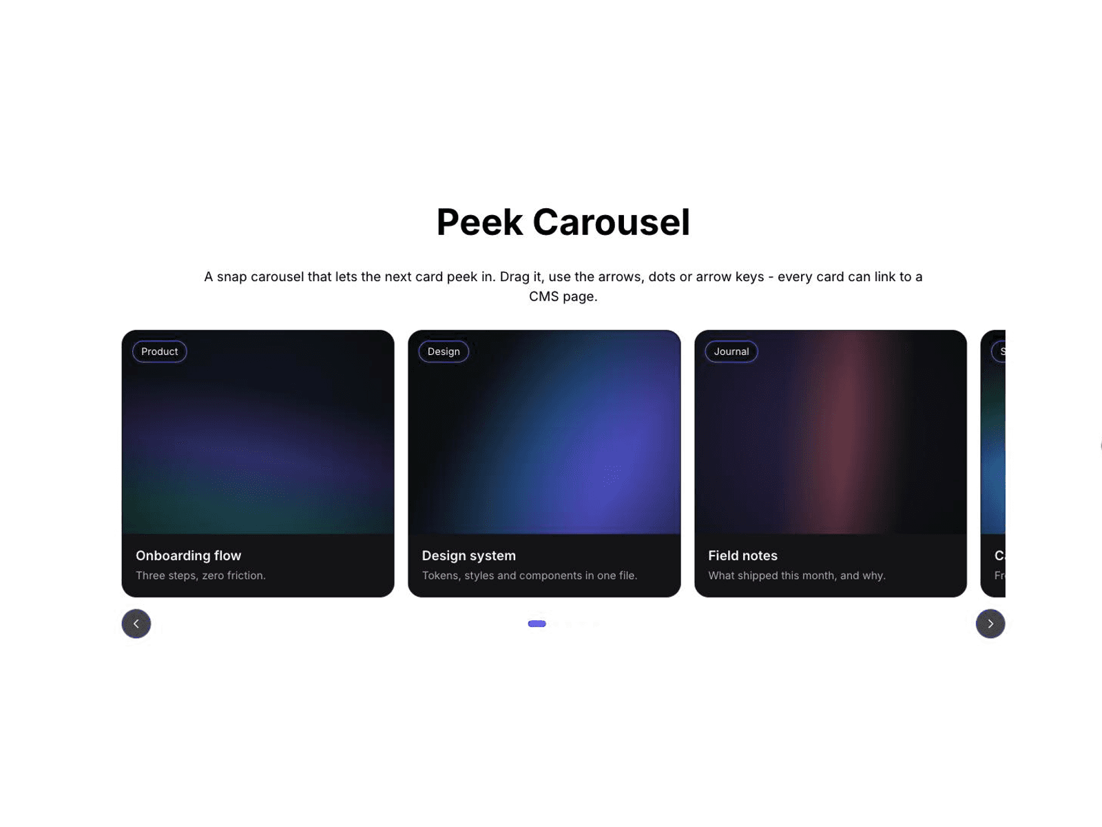
Snap carousel with peeking cards
Description
A snap carousel that lets the next card peek in from the edge — the layout that makes people swipe. Drag it, use the arrows, the dots or the arrow keys. HOW TO USE: Drop it in → open the Cards array → add an image, title, caption and a CMS link per card → set how many cards per view and how far the next one peeks in → publish. KEY FEATURES: Peeking snap carousel with 1–5 cards per view · Drag with momentum, arrows, dots and full keyboard support · Optional autoplay that pauses on hover, focus and background tabs · Per-card CMS link and badge · Responsive down to one card on mobile · Static-renderer safe (clean render on canvas and export). More components by Aisol Studio — search "CMS Video Wall" or "Commerce Mega Menu" in the Marketplace.
Introduction
Snap carousel with peeking cards
Rank history
Daily rank per list, from the first snapshot — lower is better.
- All · #2231