component
Aisol Tabs
By ulz song
Details
- ulz songAuthor
- componentType
- $14.00Price
- 2026-08-29Published
- 2026-09-02Updated
- 2026-08-29Added
- NavigationCategories
Summary
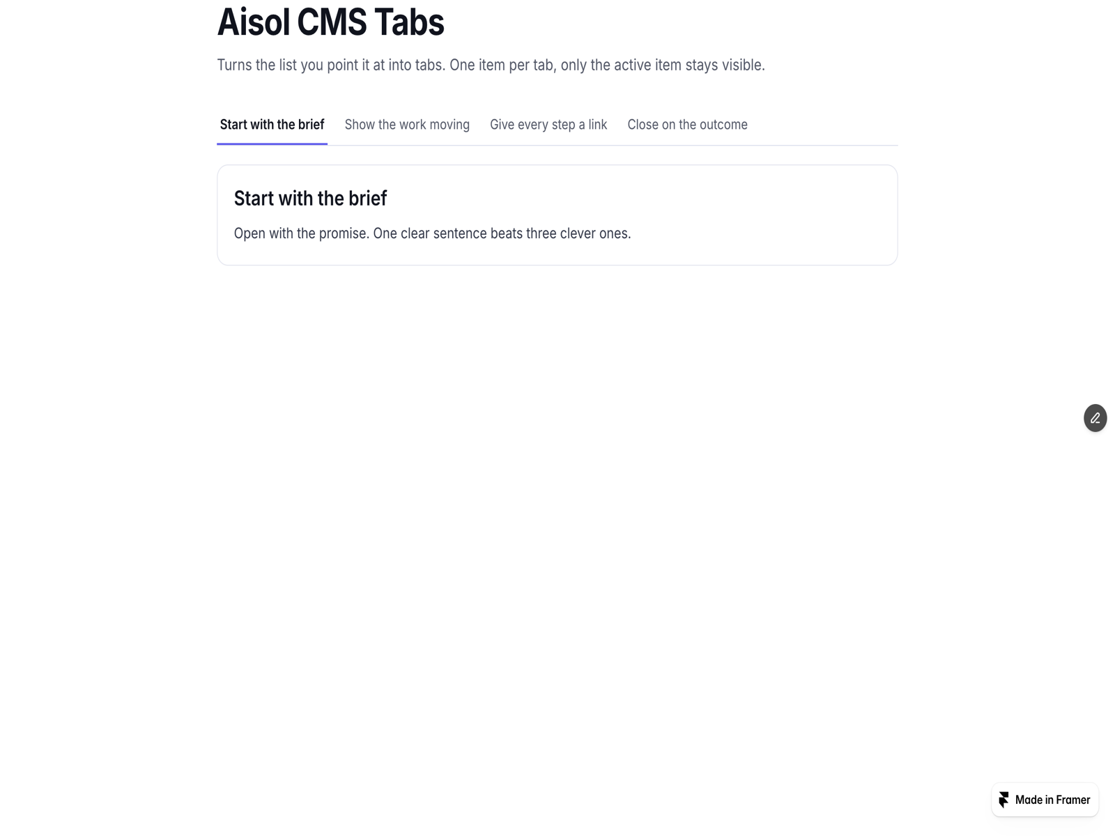
Aisol Tabs are tabs that hold real sections.
Description
Aisol Tabs are tabs that hold real sections. Drop a section, a CMS-bound component, or any other component into each panel slot, and only the active panel is rendered. Nothing outside the component is read or changed. WHY IT IS DIFFERENT: Every tab gets a deep link (?tab=slug), so a shared URL opens on the right panel. Full keyboard support: arrow keys, Home/End, roving tabindex, and proper tablist/tab/tabpanel roles. Hidden panels are not rendered at all, so there is no layout jump and no hidden content in the DOM. HOW TO USE: Add a label for each tab, then connect a component instance to each panel slot (a section you built on the canvas, a CMS list, or another component). Choose the deep-link mode (off, ?tab=, #tab-, or both), the opening tab, and whether arrow keys switch or only focus. KEY FEATURES: Deep links with replaceState (back button stays clean) and restore on load. Keyboard and screen-reader ready. Mobile: a sideways-scrolling tab bar that keeps the active tab in view, or a dropdown. Underline or pill style, fill width, and colours for accent, text, muted, tab fill, active fill and rail. Respects prefers-reduced-motion. Static-renderer safe (canvas tabs on the Framer canvas). More components by Aisol Studio: search "Aisol" in the Marketplace.
Introduction
Tabs that hold real sections
Rank history
Daily rank per list, from the first snapshot — lower is better.
- All · #8161