component
Animated Step Cards
By Matt
Details
- MattAuthor
- componentType
- $6.00Price
- 2026-09-14Published
- 2026-09-14Updated
- 2026-09-14Added
- SectionsCategories
Summary
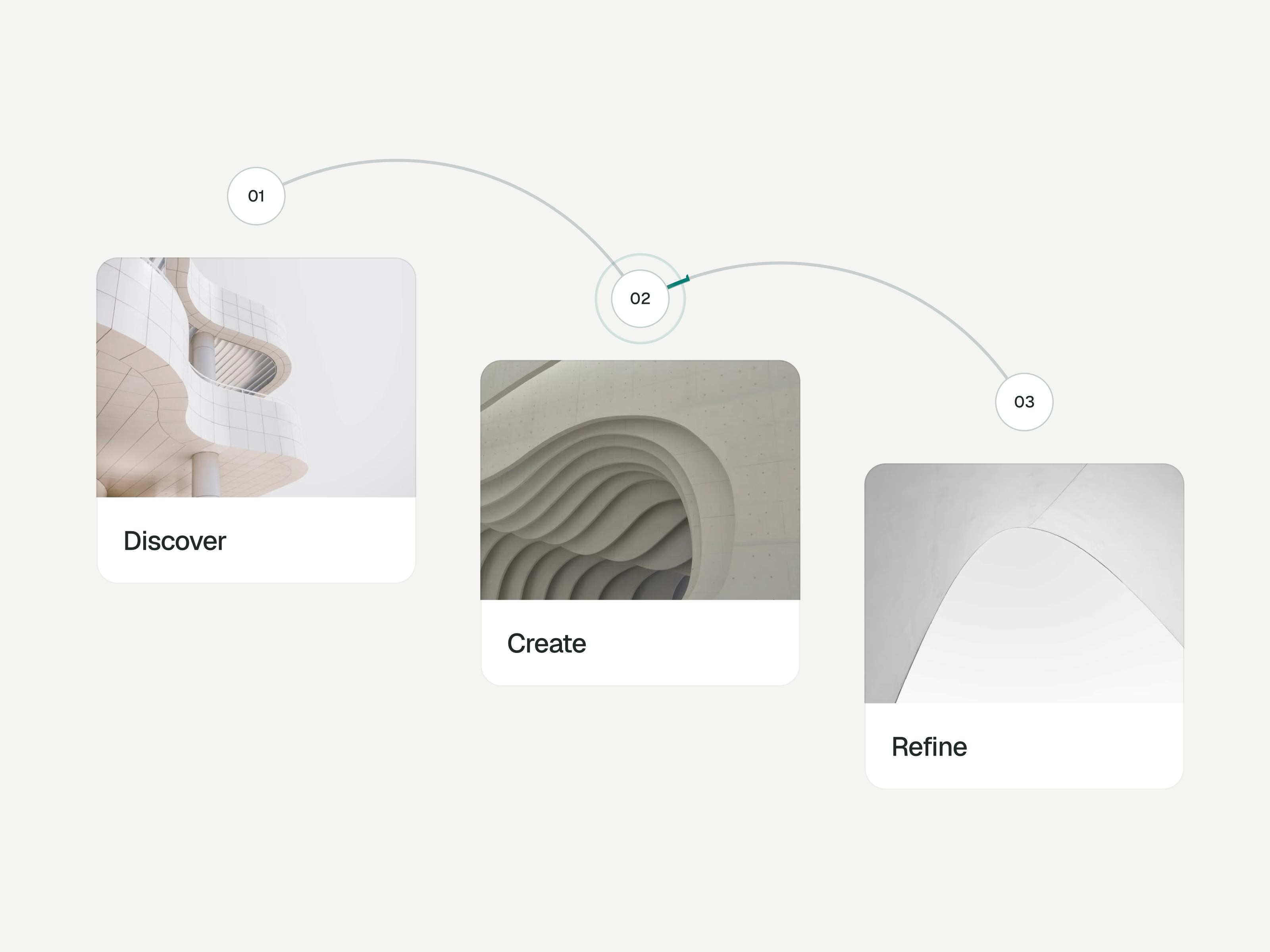
About Animated Step Cards is a native Framer component for four-step process sections and “how it works” layouts.
Description
About Animated Step Cards is a native Framer component for four-step process sections and “how it works” layouts. A moving signal follows curved connecting paths, with pulsing rings linking four numbered image cards. Desktop hover reveals short details with a subtle image zoom and accent line. Tablet and phone layouts stack the cards vertically with details visible. Each step can link to a related page. What you can customize Built entirely with native Framer elements and editable on the canvas. Change each step’s title, detail text, image, link and new-tab behavior through property controls. Adjust shared colors and toggle titles, details or animation. Typography, spacing, paths and motion timing remain editable within the native layers. Static variants hide the moving signals and rings. Great for (examples) Just a few ideas, use it anywhere you want to explain a four-stage process: How-it-works sections and product explainers Agency processes, studio workflows and service pages Client onboarding explanations and customer journeys Design processes, discovery and delivery phases Product development and launch-stage overviews Portfolio case studies and project breakdowns Consulting methods and implementation plans Four-stage roadmaps and milestone presentations Share your build If you ship something cool with it, post it on X and tag me @Matthias_Oel , or send it over. I’d love to see what you create. Need help? Questions or feedback? Reach me anytime: matthias@lmvision.de or on X @Matthias_Oel. Need a matching component? Show the finished work with MacBook Carousel or organize project links with Real Folder . Explore all components →
Introduction
Bring your process to life
Rank history
Daily rank per list, from the first snapshot — lower is better.
- All · #229