component
Bouncy Nav Pill
By Zeeshan Ahmed
Details
- Zeeshan AhmedAuthor
- componentType
- 2026-08-03Published
- 2026-08-03Updated
- 2026-08-03Added
- NavigationCategories
Summary
Responsive Smooth Navigation
Description
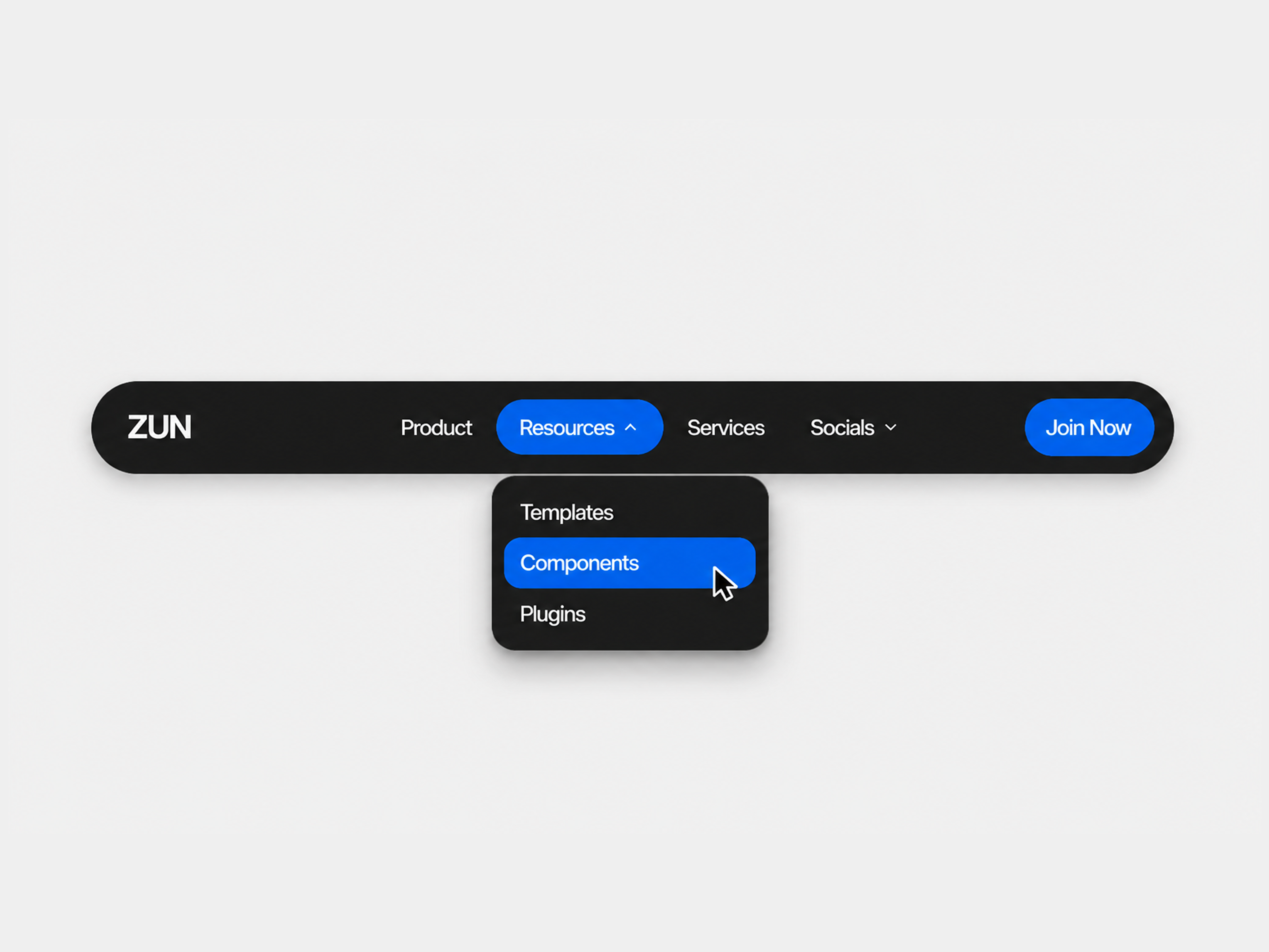
BouncyNavbar A fully customizable, responsive navigation bar with a playful spring-based hover indicator that bounces between menu items. Supports a text or image logo, multi-level dropdown menus, a call-to-action button, and a mobile-friendly accordion drawer that mirrors the desktop dropdown behavior. Every part of the navbar is organized into grouped controls for easy editing: Logo — switch between text or image, with full font, size, and color control Menu Items — add links and nested dropdown items, with shared typography and dropdown styling (radius, spacing, width) CTA — a configurable action button with its own font, padding, and radius Layout — overall width, padding, corner radius, and shadow Colors — background, hover states, and CTA colors, all reusable across menu and dropdown items Includes sticky positioning, hide-on-scroll, adjustable spring bounce physics, and a dedicated mobile breakpoint with a vertically stacked, full-width dropdown panel that opens directly below the navbar.
Introduction
Responsive Smooth Navigation
Rank history
Daily rank per list, from the first snapshot — lower is better.
- All · #349