component
Card Deck Tabs
By Kasun Nishshanka
Details
- Kasun NishshankaAuthor
- componentType
- 2026-07-02Published
- 2026-07-02Updated
- 2026-07-02Added
- NavigationCategories
Summary
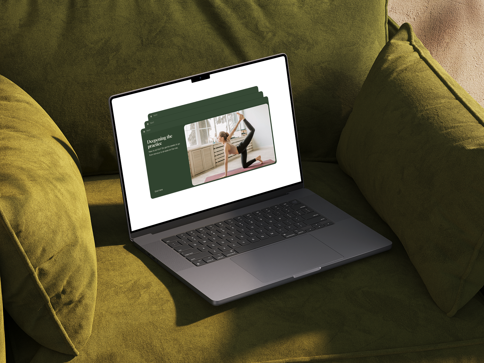
Card Deck Tabs turns a plain list into a layered deck.
Description
Perfect for editorial landing pages, service menus, pricing tiers, and portfolio showcases. Card Deck Tabs turns a plain list into a layered deck. Every option stays visible as a stacked tab click one and it glides to the front, expanding into a full showcase panel with a heading, description, call-to-action, and image. It adds motion and hierarchy without burying your content. Features Every item stays visible, active item slides forward Click / tap to switch, with smooth spring easing between layers Two-column reveal panel: heading, body copy, CTA, and image per item Set which item opens by default Separate styling for active vs. stacked (inactive) layers Optional icon or number per tab Fully responsive (Coming soon) Works with any number of items via a repeatable item list Customizations Item list: tab label, heading, body, CTA text + link, image (per item) Colors: active layer, stacked layers, text, CTA ‹verify› Typography: font, size, weight, transform for heading / body / label Layout: card radius, overlap/peek distance, panel padding, image aspect ratio Set up Add the Stacked Reveal component to your canvas Fill in the label, heading, body, CTA, and image for each item Style active vs. stacked layers to match your brand After copying the component URL, paste it into your Framer project to import it.
Introduction
Layered cards that expand on click
Rank history
Daily rank per list, from the first snapshot — lower is better.
- All · #3319