component
Circle Gallery
By Munzir Kareem
Details
- Munzir KareemAuthor
- componentType
- $8.00Price
- 2026-07-28Published
- 2026-07-28Updated
- 2026-07-28Added
- GalleriesCategories
Summary
Orbit gallery with click to expand
Description
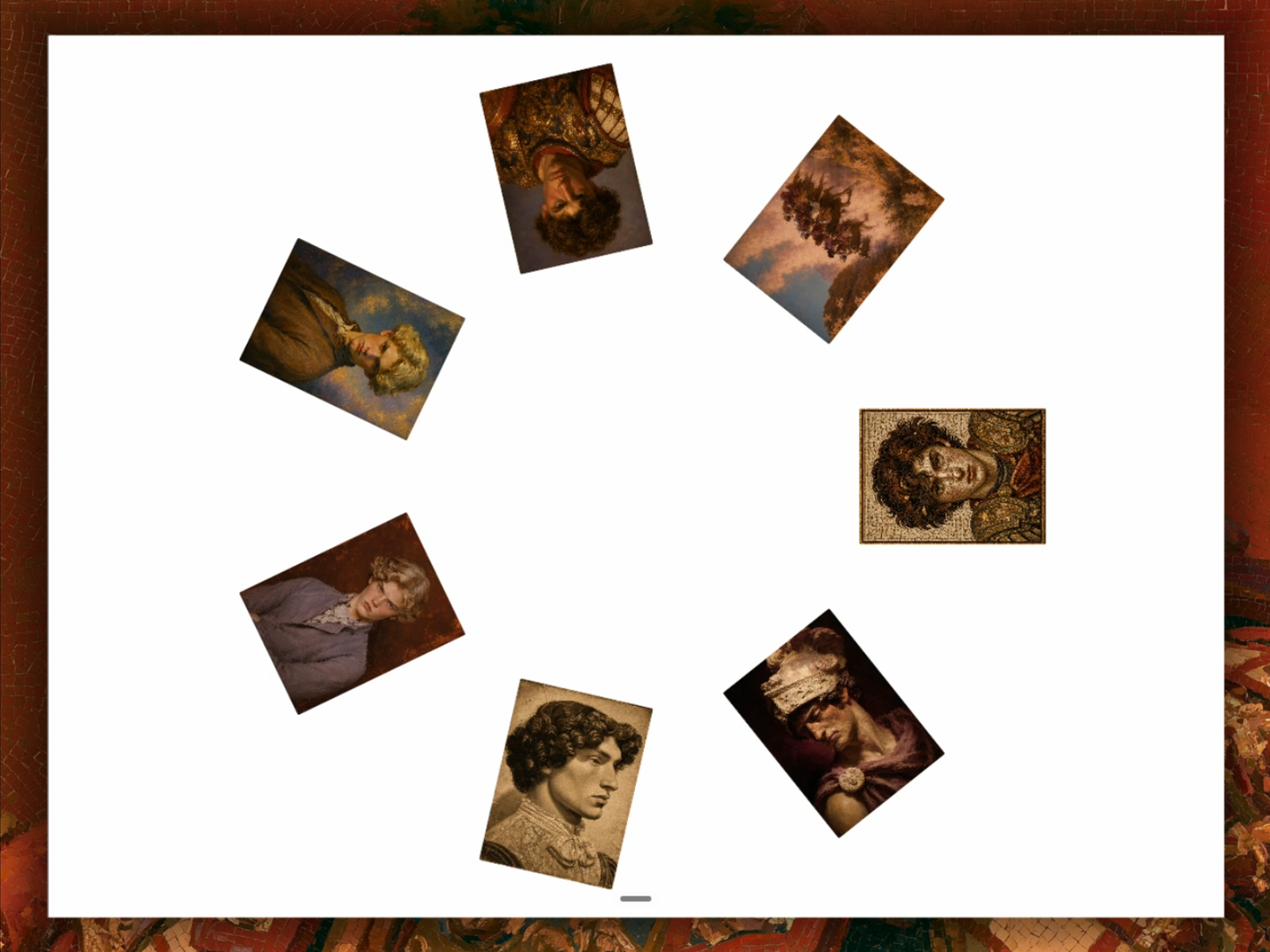
Orbit Gallery is a circular image gallery component for Framer. Images sit arranged in a ring, and clicking any one shrinks the rest, rotates the selected image upright, then expands it to fill the canvas. Features: Circular layout with adjustable radius and item spacing Click any image to expand it to a custom size Arrow navigation to switch between images while expanded Keyboard support: Enter/Space to open, Escape to close, arrow keys to navigate Smooth entrance animation that plays once the component enters the viewport Fully responsive, works on any screen size Optimized for performance, no unnecessary rendering on the Framer canvas or during export Customization: Radius, item width, item height, and item spacing all adjustable from the properties panel Expanded width and height configurable per project Add or remove images directly from the layers panel Refund policy: As this is a digital product, it is non-refundable.
Introduction
Orbit gallery with click to expand
Rank history
Daily rank per list, from the first snapshot — lower is better.
- All · #5975