component
Cursor Structule
By Damian Patkowski
Details
- Damian PatkowskiAuthor
- componentType
- 2026-08-31Published
- 2026-08-31Updated
- 2026-08-31Added
- CursorsCategories
Summary
Custom Crosshair with Hover
Description
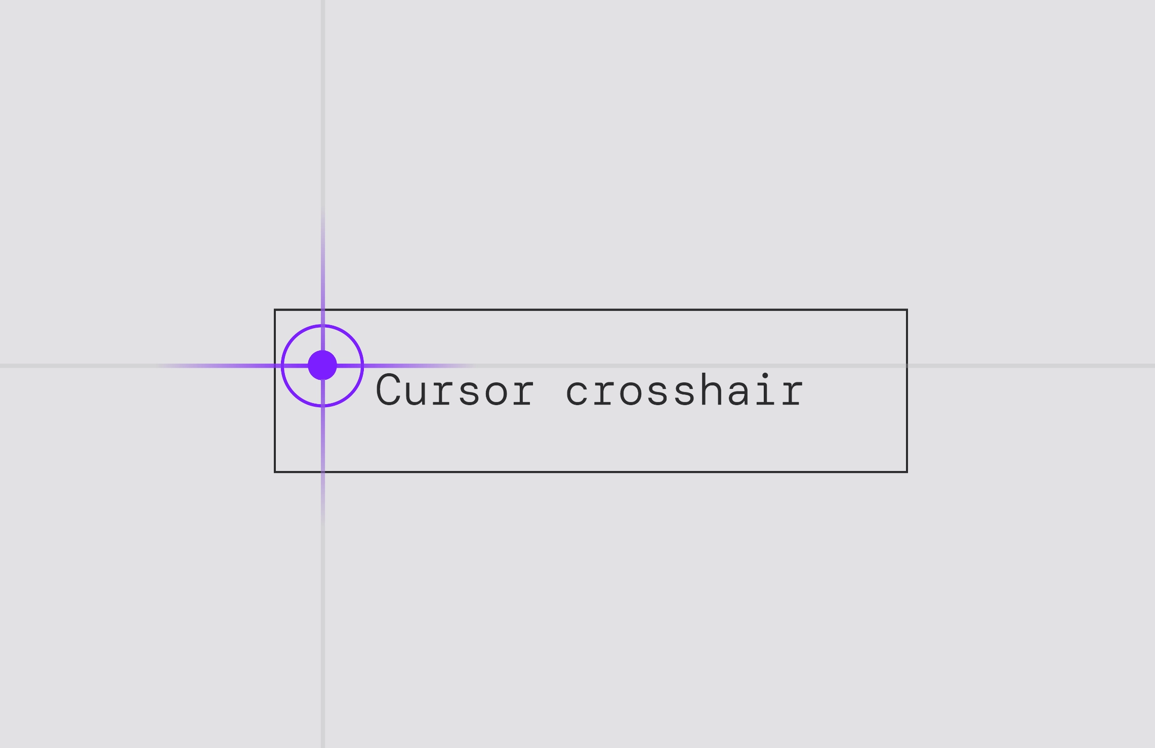
An interactive crosshair custom cursor component for Framer with smooth spring animations, hover effects, gradient line highlights, and fully customizable controls. Key Features Property Controls: Easily customize default & hover colors, dot sizes, and toggle lines directly from the Framer sidebar. Smart Hover State: Automatically detects interactive elements (buttons, links, inputs) and triggers a purple accent, smooth dot scaling, an expanding outer ring, and central gradient line highlights. How to Hide Default Browser Cursor To prevent the default system cursor from showing over your new custom cursor: Go to Project Settings in Framer. Select Custom Code and find the End of section. Paste the following snippet: * { cursor: none !important; } How to Use Drag and drop the component anywhere onto your canvas or inside your main desktop layout frame. Customize the component properties (Default Color, Hover Color, Dot Sizes, Show Lines) using the right-hand panel controls.
Introduction
Custom Crosshair with Hover
Rank history
Daily rank per list, from the first snapshot — lower is better.
- All · #945