component
Cutout Button
By Karim Saif
Details
- Karim SaifAuthor
- componentType
- 2026-08-26Published
- 2026-08-26Updated
- 2026-08-26Added
- ButtonsCategories
Summary
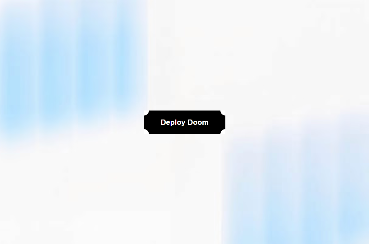
Add a bold, tactile feel to your Framer projects with Cutout Button, a customizable button component featuring dynamic corner notches and a playful edge-burst animation on hover.
Description
Add a bold, tactile feel to your Framer projects with Cutout Button , a customizable button component featuring dynamic corner notches and a playful edge-burst animation on hover. Designed to make simple CTAs feel more interactive, the button combines layered cutout shapes, subtle scaling, staggered motion, and responsive hover/focus states without requiring any extra setup. Great For 🚀 SaaS landing pages and product websites 🎨 Creative portfolios and personal websites 🕹 Gaming and entertainment interfaces ⚡ Bold call-to-action sections 🧪 Experimental and interactive web designs 🖤 Brutalist and editorial-inspired websites ✨ Hero sections and promotional banners Customize Everything Use Framer's property controls to quickly adapt the button to your design. Appearance Background color Text color Cutout color Hover cutout color Cutouts Corner cutout size Inner cutout size Number of inner cutouts Animation Hover scale Animation duration Stagger delay Typography & Layout Font size Font weight Horizontal padding Vertical padding Border radius Accessibility Custom ARIA label Create anything from a minimal CTA to a loud, experimental interaction — all directly from the Framer property panel. Support Need help customizing the component or found an issue? 📧 Email: karimsaif010@gmail.com 𝕏 X: @karimsaif0 If you enjoy the component, feel free to share your work and tag me on X. I'd love to see what you create with it. Made with 💛 by Karim Saif
Introduction
Corner notches and a playful edge
Rank history
Daily rank per list, from the first snapshot — lower is better.
- All · #5551