component
Depth Button
By Matt
Details
- MattAuthor
- componentType
- 2026-06-07Published
- 2026-06-22Updated
- 2026-06-07Added
- ButtonsCategories
Summary
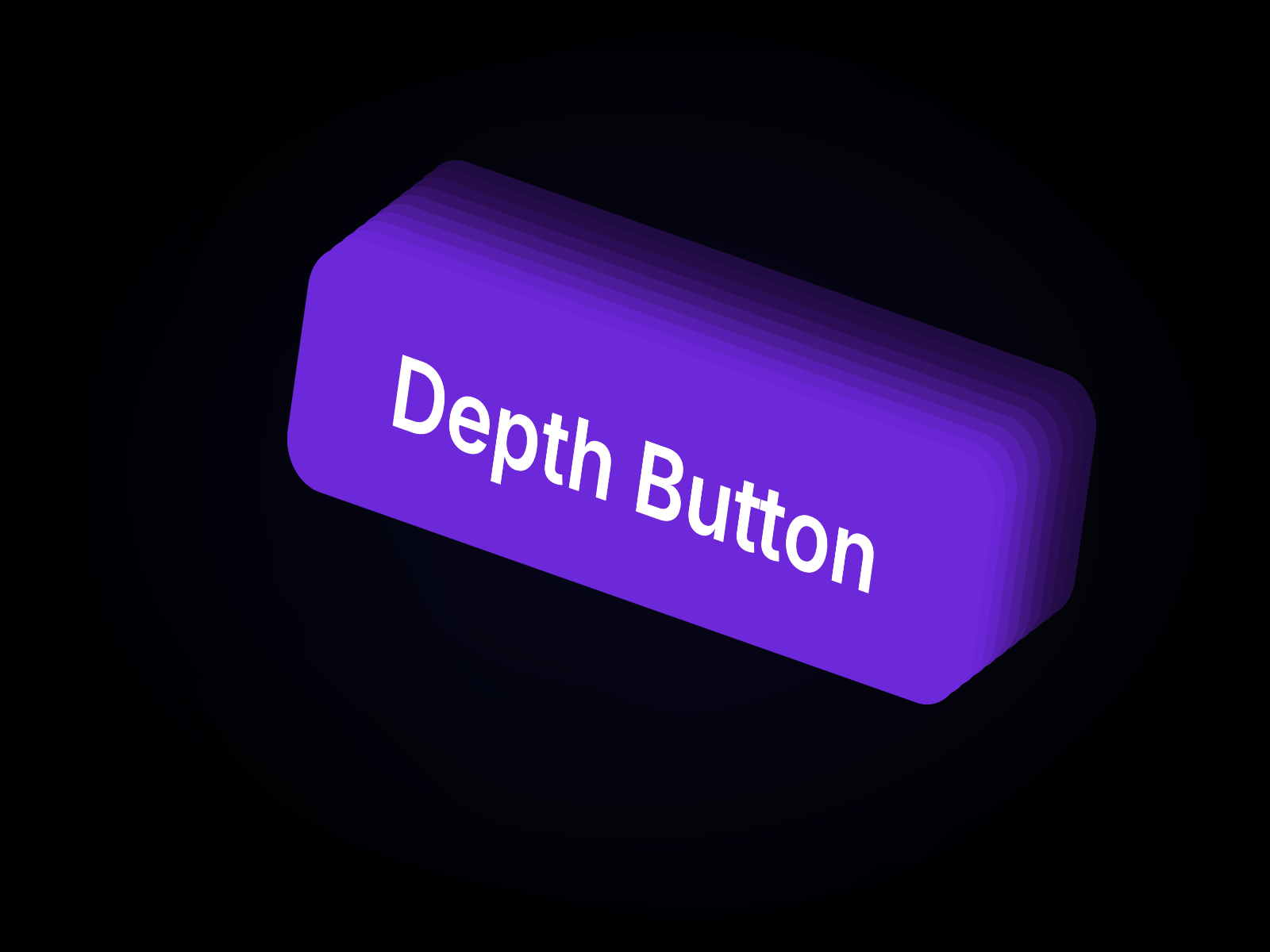
Interactive buttons with real depth
Description
What it does Turns a simple button into a more playful and polished interaction with layered depth, directional shadows, animated hover movement, static press-style variants, outline styling, and optional glow. It is made to give your buttons more character, depth, and visual weight without making your design feel overloaded. What you can customize Full control from the Framer panel: text, background color, text color, hover background color, hover text color, fill or outline style, shadow layers, shadow direction, shadow tone, animation type, glow, border radius, padding, and font. Everything is easy to adjust, responsive, and made to fit different layouts without touching code. Great for (examples) Just a few ideas, use it anywhere you want a stronger and more polished CTA: hero section buttons SaaS landing pages product launches waitlist signups pricing sections portfolio websites playful brand websites modern contact buttons template previews Share your build If you ship something cool with it, post it on X and tag me @Matthias_Oel , or send it over. I’d love to see what you create. Need help? Questions or feedback? Reach me anytime: matthias@lmvision.de or on X @Matthias_Oel.
Introduction
Interactive buttons with real depth
Rank history
Daily rank per list, from the first snapshot — lower is better.
- All · #2485