component
Drawer Popup
By Framer-Expert
Details
- Framer-ExpertAuthor
- componentType
- 2026-02-11Published
- 2026-09-14Updated
- 2026-01-21Added
- NavigationCategories
Summary
Animated Side Panel with Staggee Effect
Description
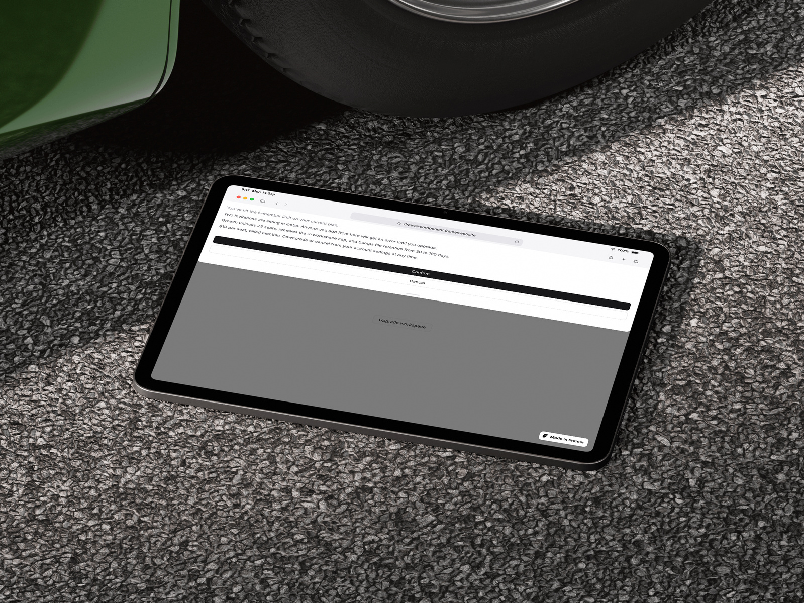
A fully customizable drawer component with smooth spring animations, staggered content reveals, and support for all four directions.A production-ready drawer component inspired by shadcn/ui and Vaul, rebuilt from scratch for Framer with zero dependencies beyond framer-motion. ✦ Open from any direction Slide in from top, bottom, left, or right. Perfect for mobile menus, settings panels, cart sidebars, or modal-style content. ✦ Staggered animations Each element animates in sequence with customizable timing and direction. Control the delay between items and choose whether content animates up or down for that polished, intentional feel. ✦ Flexible content placement Position your header and copy at the top or bottom of the drawer. Adapts to your layout needs whether you're building a confirmation modal, onboarding flow, or upgrade prompt. ✦ Full styling control Customize everything from the property panel — colors, border radius, padding, overlay opacity, and drawer size. No code required. Features: — 4 slide directions (top, right, bottom, left) — Spring-based open/close animations — Staggered content reveal with adjustable timing — Click-outside to close — Scroll lock when open — Handle bar for bottom/top sheets — 3 customizable paragraphs with show/hide toggles — Fully styled trigger button — Submit and cancel actions Perfect for: — Mobile navigation menus — Settings or filter panels — Shopping cart sidebars — Upgrade/pricing prompts — Onboarding flows — Confirmation dialogsUpdate 06 June: added native Framer Typ Controll, now you can choose your Font Style, size style for all the copy on the component.Update: Now you can customise all the Typ, Size, and Fonts styles.
Introduction
Animated side drawer with stagger
Rank history
Daily rank per list, from the first snapshot — lower is better.
- All · #6050