component
Editorial Focus Card
By Ansh Jswl
Details
- Ansh JswlAuthor
- componentType
- $5.00Price
- 2026-07-14Published
- 2026-07-15Updated
- 2026-07-14Added
- CardsCategories
Summary
One card, two moods — flip between
Description
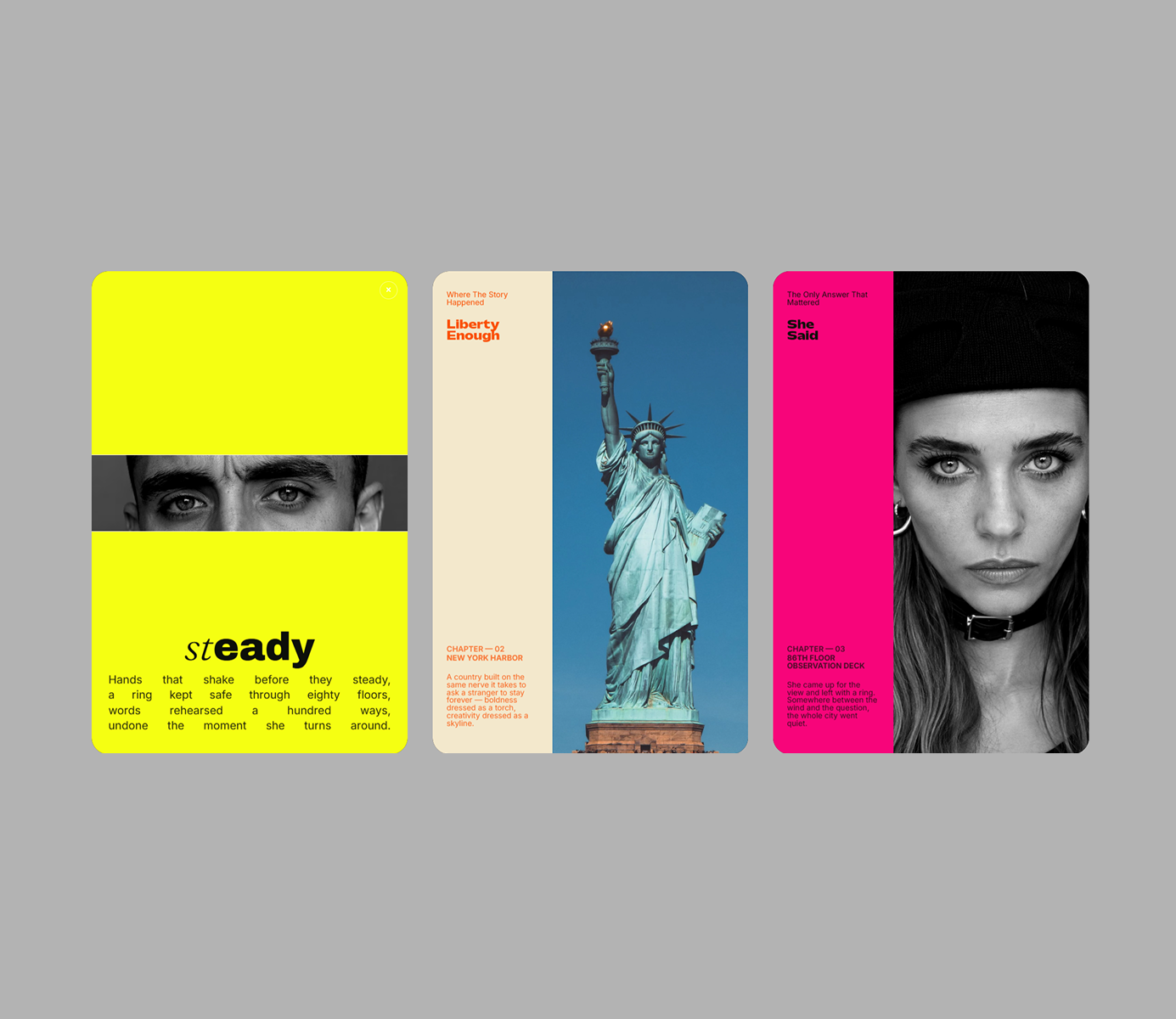
Focus Card — an editorial cover that pulls into focus Focus Card is a code component that turns a simple portrait card into a two-act story. In its resting state, it reads like a magazine cover — a bold color panel, kicker, title, issue meta, and body copy sitting beside a portrait. Click it, and the whole thing morphs: the panel floods into a full-bleed background, the portrait pushes in and darkens, a cropped strip reveals a close-up detail, and a large typographic wordmark fades in with a justified poem beneath it. One click back, and it returns to the cover. Every transition is handled with smooth, orchestrated motion — no jump cuts, no layout shift — so it feels like one continuous camera move rather than two separate screens. Fully customizable, no code required: Swap in your own portrait image Toggle black & white or full color Set independent colors for the cover panel and the focus background Adjust the reveal strip's position, size, zoom, and crop offset Independent font, size, and color controls for the title, kicker, issue label, date label, body text, poem, and wordmark Adjustable corner radius Great for: Portfolio and case-study cards Editorial or magazine-style landing pages Team/about pages with a memorable reveal Any place a static card feels like it's missing a story Drop it into any Framer project, connect your content, and it just works.
Introduction
One card, two moods — flip between
Rank history
Daily rank per list, from the first snapshot — lower is better.
- All · #6043