component
Expandable Cards
By Zaid
Details
- Zaid Author
- componentType
- $5.00Price
- 2026-06-13Published
- 2026-07-13Updated
- 2026-05-05Added
- CardsCategories
Summary
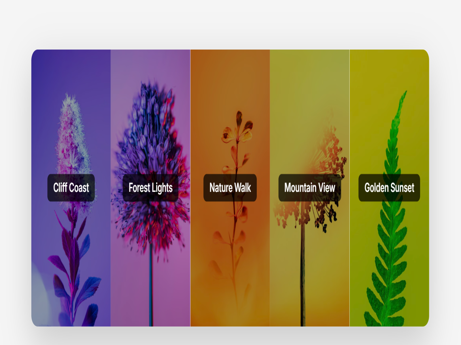
Expandable Cards is a sleek, highly interactive accordion-style gallery component built for Framer creators who want to showcase images, services, or portfolios with cinematic…
Description
Dynamic Expandable Cards Dynamic Expandable Cards is a sleek, highly interactive accordion-style gallery component built for Framer creators who want to showcase images, services, or portfolios with cinematic flair. Ditching static grids, this component uses fluid spring-based animations to expand individual panels on hover or click, drawing user focus and delivering a highly tactile, premium browsing experience. It is completely customizable without a single line of code—allowing you to easily swap images, customize text overlays, and adjust expansion physics to match your brand's unique energy. Best For Product & Feature Showcases: Break down product benefits, steps, or features in an interactive, space-saving format. Creative & Photography Portfolios: Show off stunning landscape imagery, project case studies, or design mockups. Destination & Travel Landing Pages: Highlight different locations or packages with high-impact visuals. Meet the Team Pages: Give each team member an engaging, expandable profile panel. Interactive Hero Sections: Replace standard static heroes with an interactive gateway to different areas of your website. Why This Component This component bridges the gap between complex web animation and pure simplicity. It is designed to look and feel custom-coded, giving your site a premium polished edge while remaining highly optimized for speed and SEO.No bloated code, no complex setups—just gorgeous, responsive interactivity right out of the box.
Introduction
Dynamic Expandable Card
Rank history
Daily rank per list, from the first snapshot — lower is better.
- All · #3988