component
Gallery Grid
By Tamás Péter
Details
- Tamás PéterAuthor
- componentType
- 2026-08-12Published
- 2026-08-12Updated
- 2026-08-12Added
- GalleriesCategories
Summary
Filterable gallery with lightbox
Description
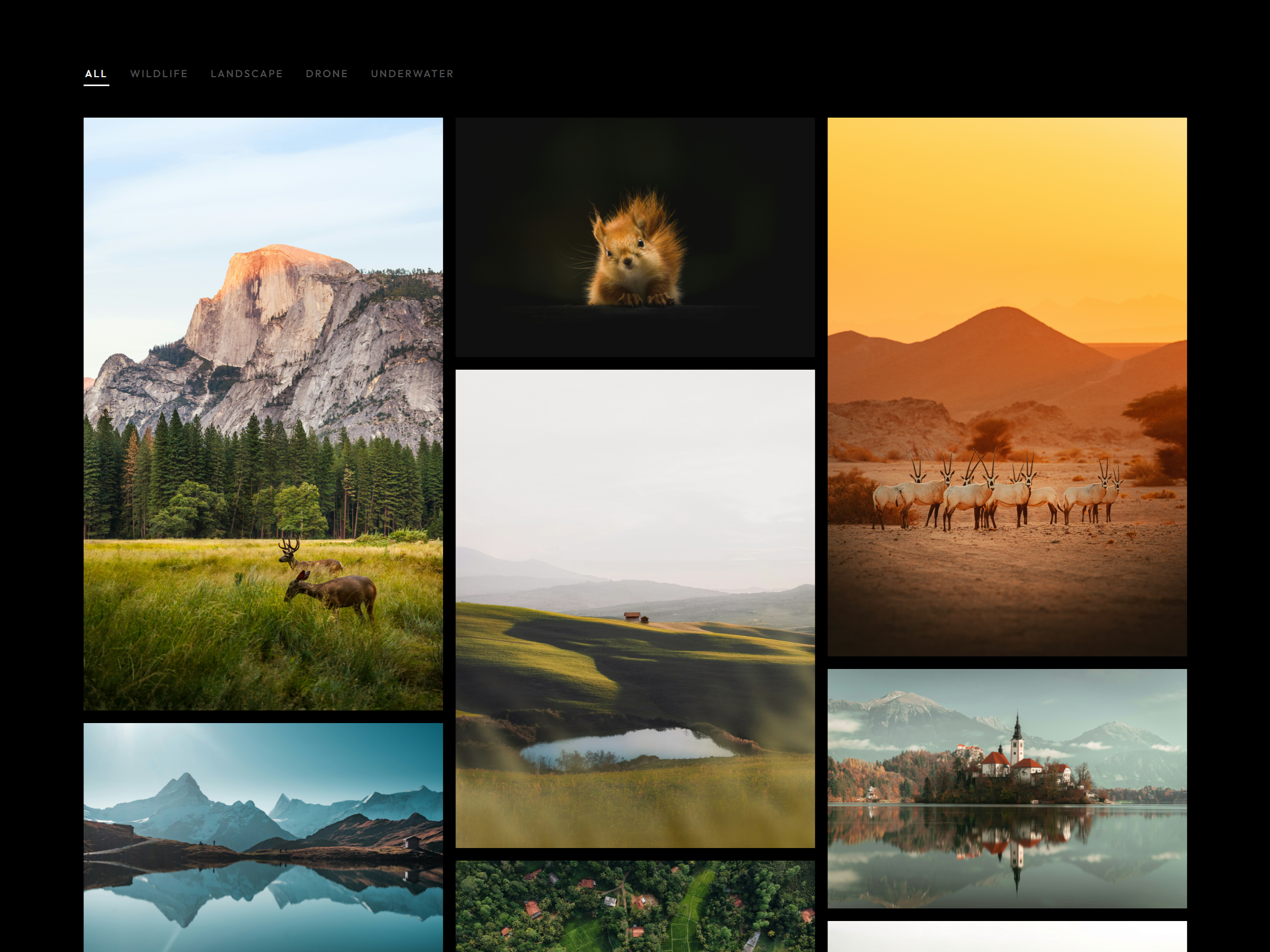
A filterable photo gallery with a fullscreen lightbox. Drop it on a page, add your images in the panel, and you have a working portfolio grid - no CMS, no custom code, no theme setup required. The grid Add photos in the panel: image, title, category, location Filter bar with an "All" button - categories are fully renamable 3 layouts: uniform grid, masonry, or a shape preset per photo Column count set separately for desktop and tablet, single column on mobile Hover overlay with the photo title and an adjustable zoom The lightbox Opens fullscreen, scoped to the active category Arrow-key navigation, Escape or click-outside to close Optional caption under the image: location name, Google Maps link, Instagram link Arrows and close button beside the image or at the screen edges Optional page zoom-out and blur behind the overlay Photo counter you can style or hide Made to customize Dark, Light, or Auto theme - Auto follows your site's theme toggle or the visitor's OS setting Every color has a dark and light value Type any Google Font name and it loads automatically Full control over sizes, spacing, padding, and letter spacing Scroll-reveal animation with adjustable stagger, speed, and delay Panel controls grouped into Theme, Content, Colors, Typography, Layout, Lightbox, Caption, and Animation Responsive across desktop, tablet, and mobile. Built for the Exposure photography template - https://exposuretemplate.framer.website
Introduction
Filterable gallery with lightbox
Rank history
Daily rank per list, from the first snapshot — lower is better.
- All · #1390