component
Get In Button
By Karim Saif
Details
- Karim SaifAuthor
- componentType
- 2026-06-29Published
- 2026-06-29Updated
- 2026-06-29Added
- ButtonsCategories
Summary
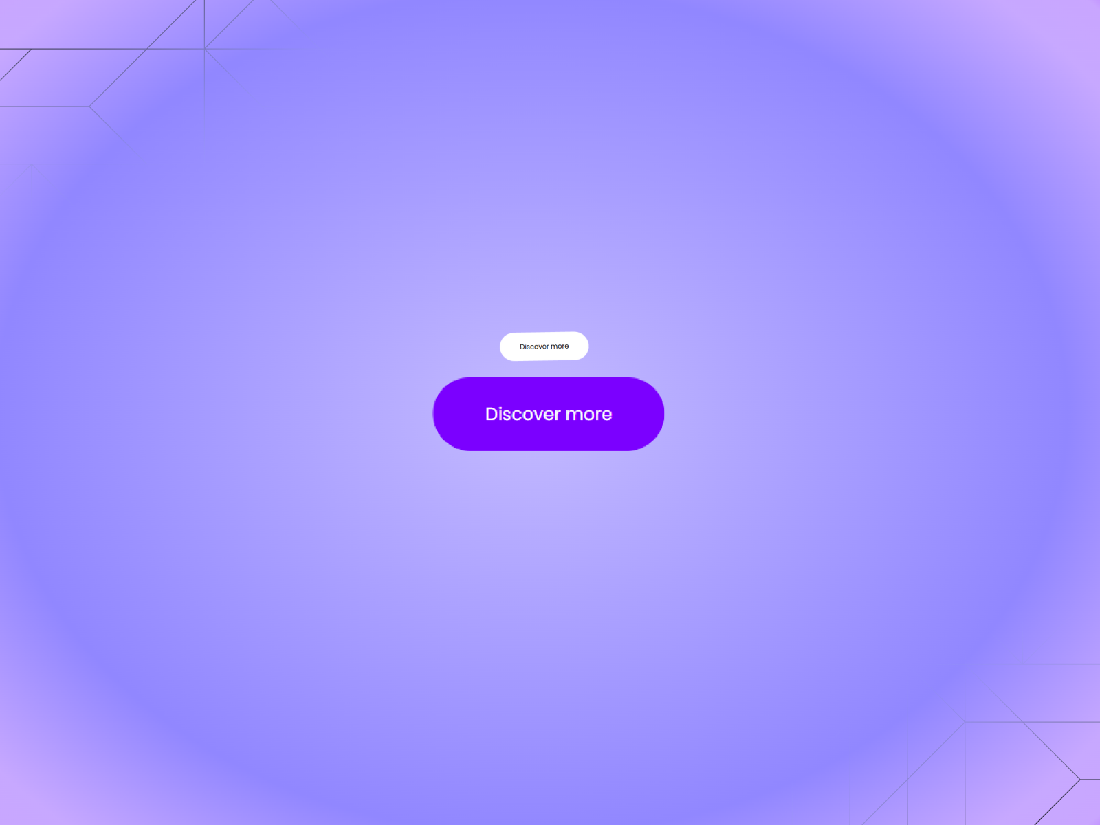
About Get In Button is a minimal CTA button with a clever vertical slide interaction.
Description
About Get In Button is a minimal CTA button with a clever vertical slide interaction. On hover, a colored pill version of the label slides up from below to replace the default text giving the button a layered, satisfying feel without any extra complexity. What it does The button stacks two text layers inside a clipped container. At rest, only the plain label is visible. On hover, the pill-shaped colored version slides in from below, creating a smooth vertical reveal. The overflow is clipped so the transition feels clean and intentional — like the button has a hidden layer waiting underneath. What you can customize Full control from the Framer panel: button text, top text color, pill background color, pill text color, and border radius. No code needed everything adjusts from the properties panel. Great for (examples) Use it anywhere you want a hover interaction that surprises without being loud: * hero section CTAs * SaaS and startup landing pages * portfolio and personal brand sites * product launch pages * waitlist and signup buttons * pricing section actions * agency and creative studio sites * Framer template previews Share your build If you ship something cool with it, post it on X and tag me @karimsaif0, or send it over. I would love to see what you create. Need help? Questions or feedback? Reach me anytime: karimsaif010@gmail.com or on X @karimsaif0
Introduction
A CTA button with a vertical slide
Rank history
Daily rank per list, from the first snapshot — lower is better.
- All · #4280