component
Glimpse Card
By Aprilia Gunawan
Details
- Aprilia GunawanAuthor
- componentType
- 2026-07-16Published
- 2026-07-16Updated
- 2026-07-16Added
- CardsCategories
Summary
A hover-triggered card that tilts
Description
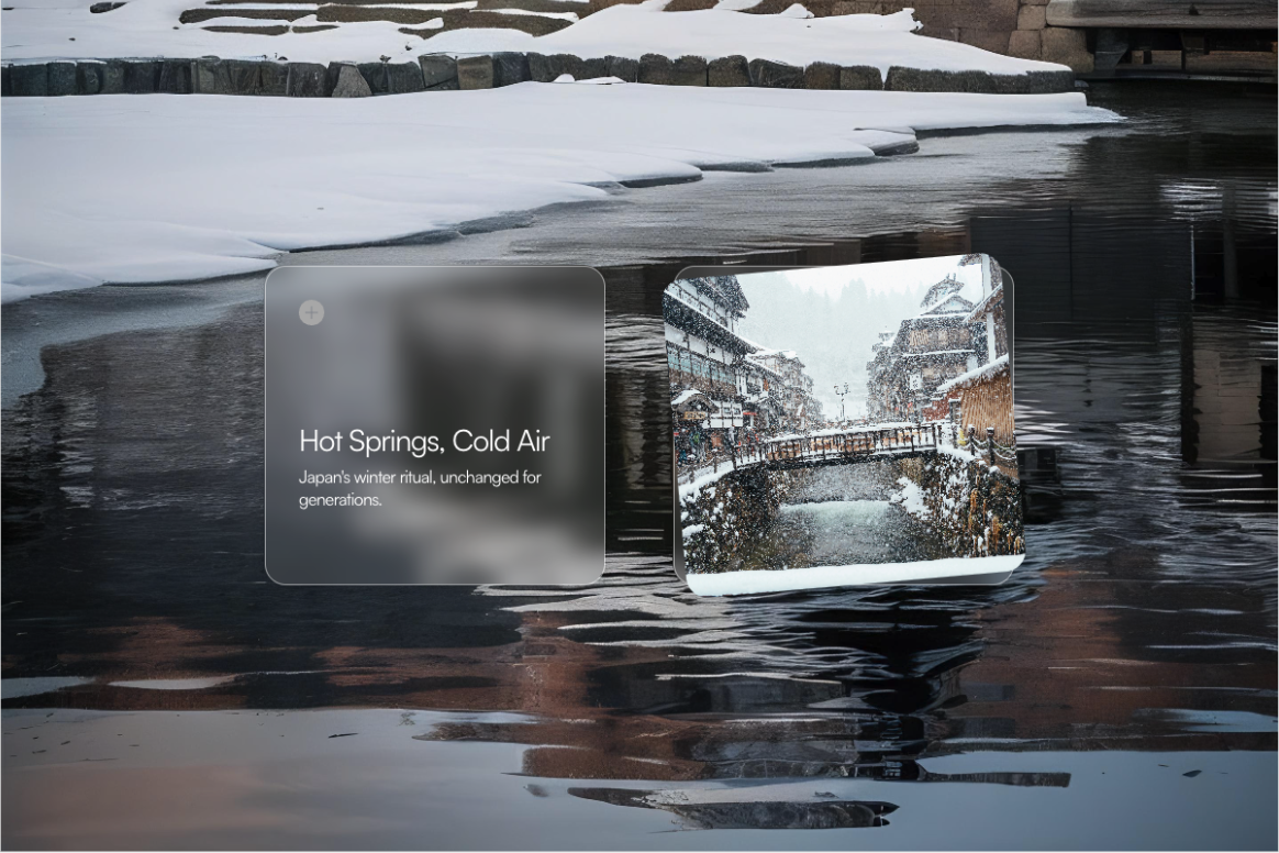
A minimal title + description on rest, tilting open on hover to reveal a full image with a soft blurred-background fill. What you can customize: Variant — left-tilt or right-tilt, so cards can alternate direction across a grid Trigger — set your own hover/tap trigger Title & Description — fully editable text Image — drop in any image, blurred background fill keeps it framed cleanly at any size Fill color — customize the base card color Background blur — adjust intensity Corner radius — from sharp to fully rounded Border & shadow — style to match your project Image rotation — fine-tune the tilt angle on the reveal image Swap the text and image, the interaction stays smooth — built for travel content, portfolio case studies, editorial teasers, product features, or real estate listings.
Introduction
A hover-triggered card that tilts
Rank history
Daily rank per list, from the first snapshot — lower is better.
- All · #5162