component
Hanging Cards
By Noor Afzal
Details
- Noor AfzalAuthor
- componentType
- $10.00Price
- 2026-07-12Published
- 2026-07-12Updated
- 2026-07-12Added
- CardsCategories
Summary
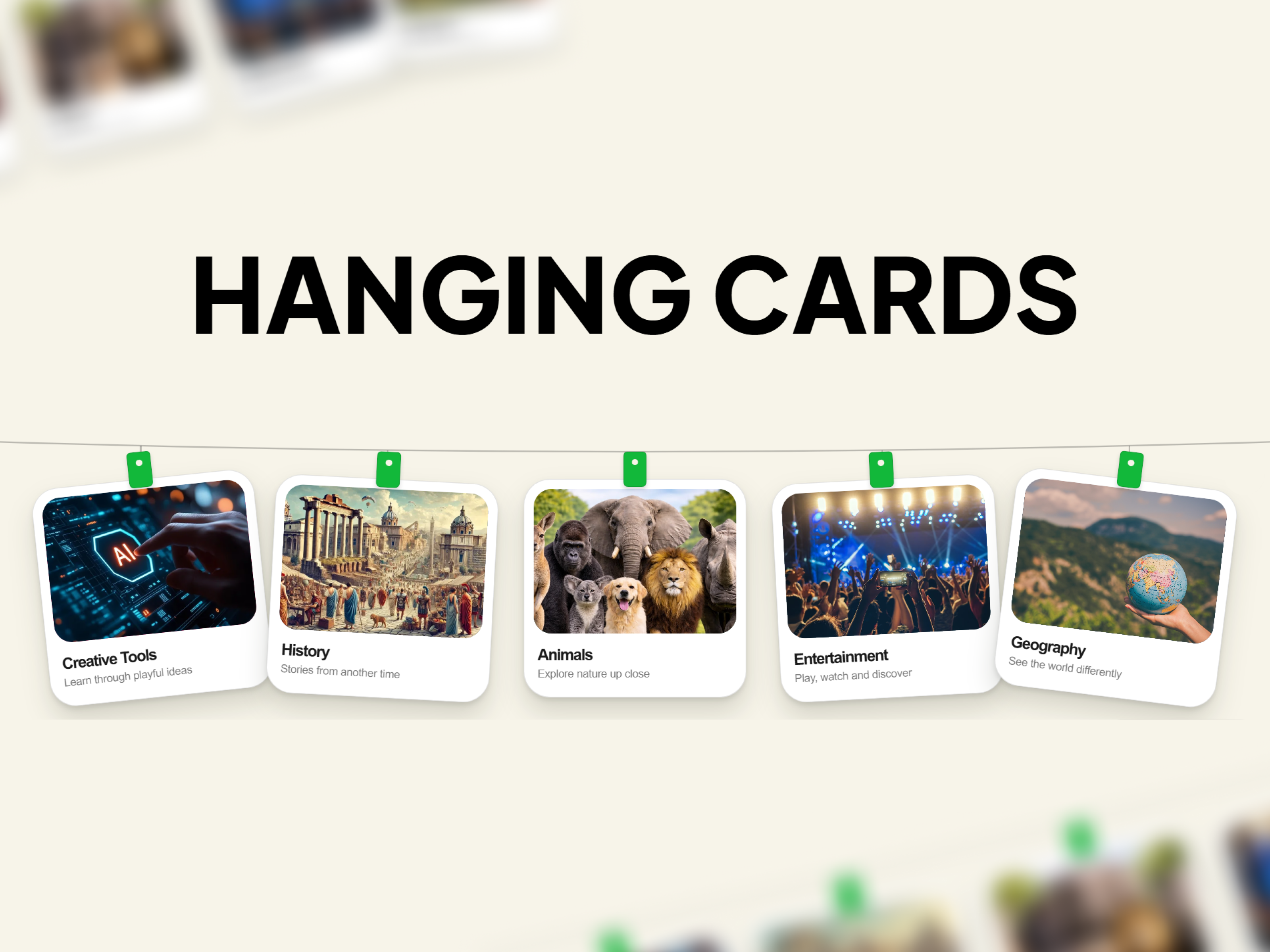
Create engaging visual sections with Hanging Cards Gallery, a premium Framer Code Component that displays content as cards suspended from a single responsive curved wire.
Description
Create engaging visual sections with Hanging Cards Gallery , a premium Framer Code Component that displays content as cards suspended from a single responsive curved wire. Each card hangs naturally using a connecting cord and customizable pin, creating a clean presentation for portfolios, products, education content, services, galleries, and landing pages. The component is designed specifically for Framer Marketplace standards. Swing animation runs only in Preview and on published websites while remaining disabled inside the Framer Canvas, exports, and thumbnails for a distraction-free editing experience. Every part of the component is editable through Framer Properties. Change images, titles, descriptions, colors, spacing, card sizing, rotation, animation settings, and more without touching the code. Lightweight, responsive, and easy to customize, Hanging Cards Gallery fits seamlessly into modern websites and creative projects. Features Responsive layout for all screen sizes Full-width adaptive curved hanging wire Realistic hanging cords and customizable pins Smooth linear swing animation Animation automatically disabled in Framer Canvas, exports, and thumbnails Editable images, titles, descriptions, pin colors, and card rotation Adjustable card width, corner radius, spacing, and colors Editable wire color and thickness Animation toggle Adjustable animation speed Adjustable swing amount Built-in fallback artwork when no image is provided No external libraries or dependencies Lightweight and optimized Easy to customize with Framer Properties
Introduction
Features Responsive layout for all
Rank history
Daily rank per list, from the first snapshot — lower is better.
- All · #2773