component
Hover Scale Text
By Munzir Kareem
Details
- Munzir KareemAuthor
- componentType
- $5.00Price
- 2026-07-29Published
- 2026-07-29Updated
- 2026-07-29Added
- TextCategories
Summary
Hover-driven letter scaling effect
Description
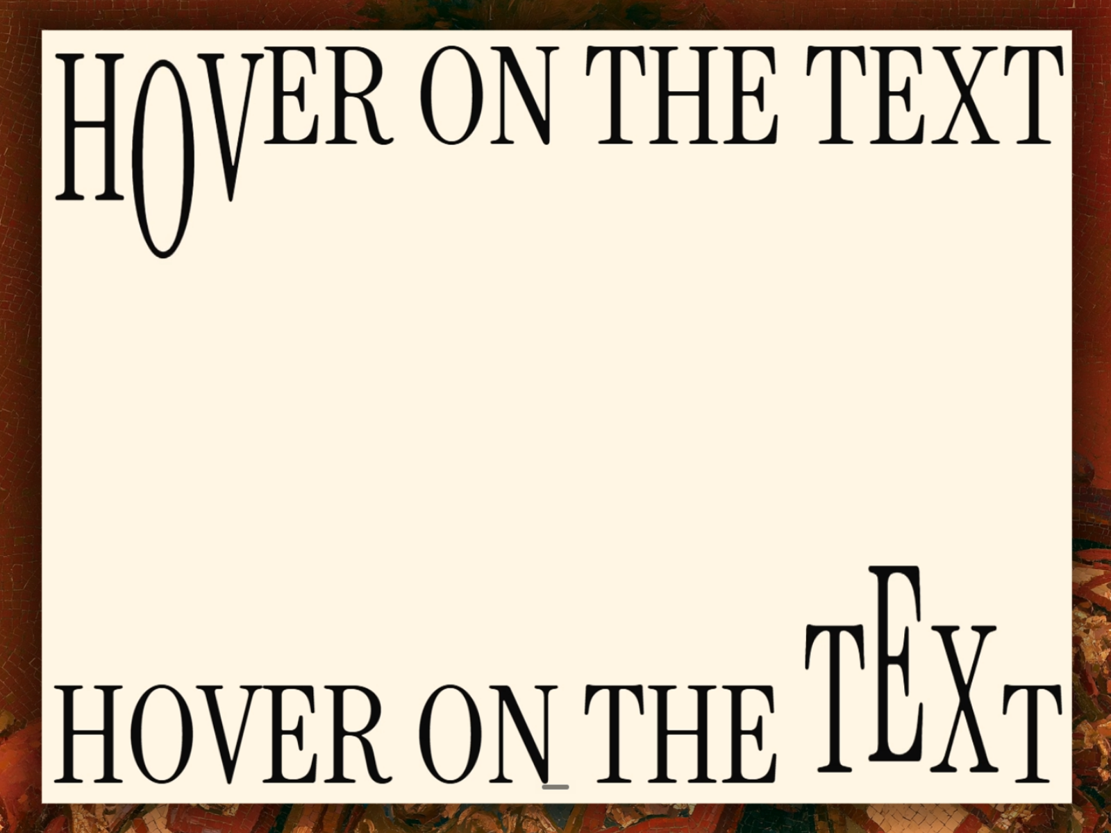
Text Hover Scale is a hover-driven text animation component. Each line becomes its own row of individually interactive letters — hover any letter and it scales up smoothly, with its neighbors scaling to a lesser degree, then easing back to rest when you move away. Features: Per-letter hover scaling with adjustable max scale and neighbor falloff Auto-fit sizing — text scales to match your frame's width or width + height, just like a native Framer text layer Customizable scale origin (top, center, or bottom) Optional hover color, separate from the base text color Full typography control (font, size, weight, letter spacing, line height) Adjustable letter gap, row gap, and alignment (horizontal + vertical) Configurable transition duration and easing curve Uppercase toggle Multi-line support — each line breaks into its own letter row automatically Optimized for canvas and export: hover effects are automatically disabled during static rendering for clean thumbnails and exports Great for: Hero headlines and landing page titles Portfolio and case study intros Playful nav items or buttons Any spot that needs a little personality on hover Refund Policy: This is a digital product, so no refunds are offered once purchased. Component Demo
Introduction
Hover-driven letter scaling effect
Rank history
Daily rank per list, from the first snapshot — lower is better.
- All · #1065