component
Interactions Pack
By Har1sG
Details
- Har1sGAuthor
- componentType
- $2.00Price
- 2026-04-13Published
- 2026-08-11Updated
- 2026-04-01Added
- CardsCategories
Summary
Card Interactions Pack is a single drag-and-drop Framer component with four distinct, production-ready interactions.
Description
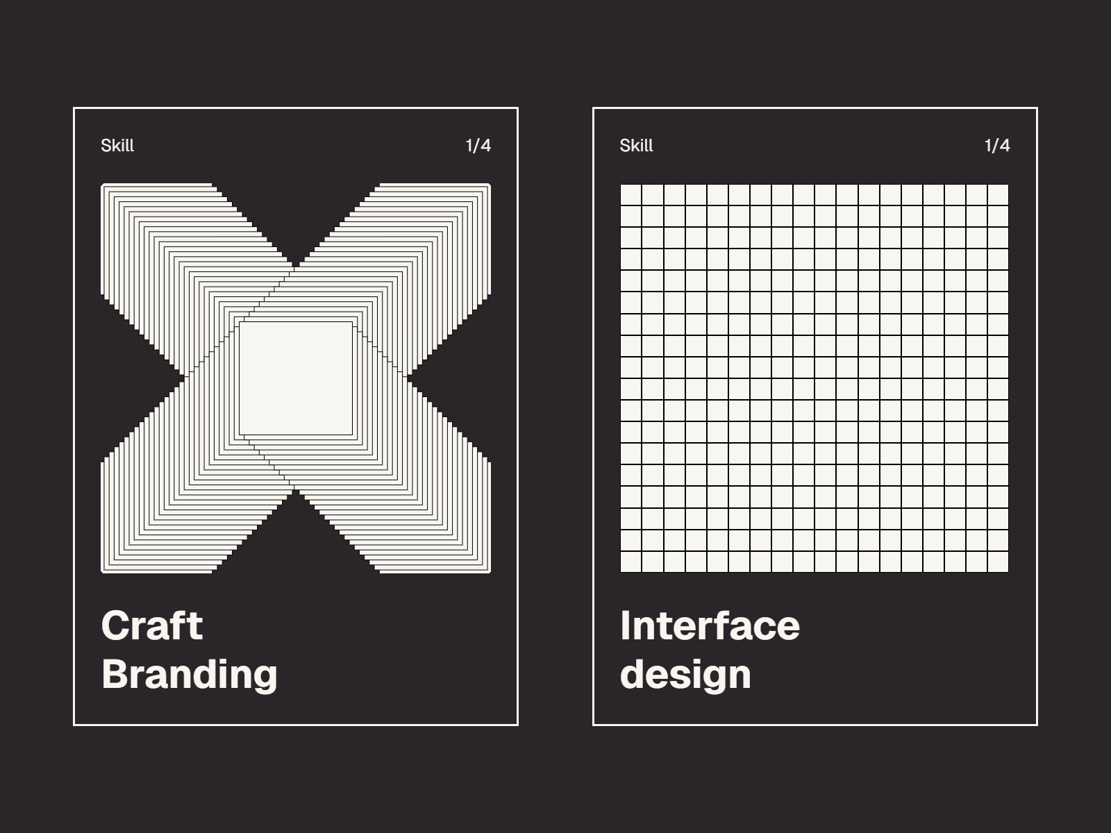
Card Interactions Pack is a single drag-and-drop Framer component with four distinct, production-ready interactions. Pick a variant, customize, and drop it into any card layout. No extra setup required. Recursive Circles Hover over the circle and it splits into four. Each child splits again on hover, up to 8 levels deep. Spring-animated, satisfying, and oddly hard to stop hovering. Block Grid A dense grid of cells that disappear on hover and slowly fade back in. Tune the grid density, fade delay, and fade speed to match your design system. Trail Squares Move your cursor across the card to paint a trail of layered squares. Double-click anywhere to reset back to the default X pattern. Ripple Rects A grid of rectangles that tilt toward your cursor within a defined radius, then snap back smoothly when you leave. Every variant includes: Full customization control for elements Responsive — adapts to any card size automatically Smooth, performant animations with no dependencies Configurable via Framer property controls — no code needed
Introduction
Interactions to make your UI alive
Rank history
Daily rank per list, from the first snapshot — lower is better.
- All · #4395