component
Loadly
By DariStudio
Details
- DariStudioAuthor
- componentType
- $8.00Price
- 2026-07-07Published
- 2026-07-07Updated
- 2026-07-07Added
- LoadersCategories
Summary
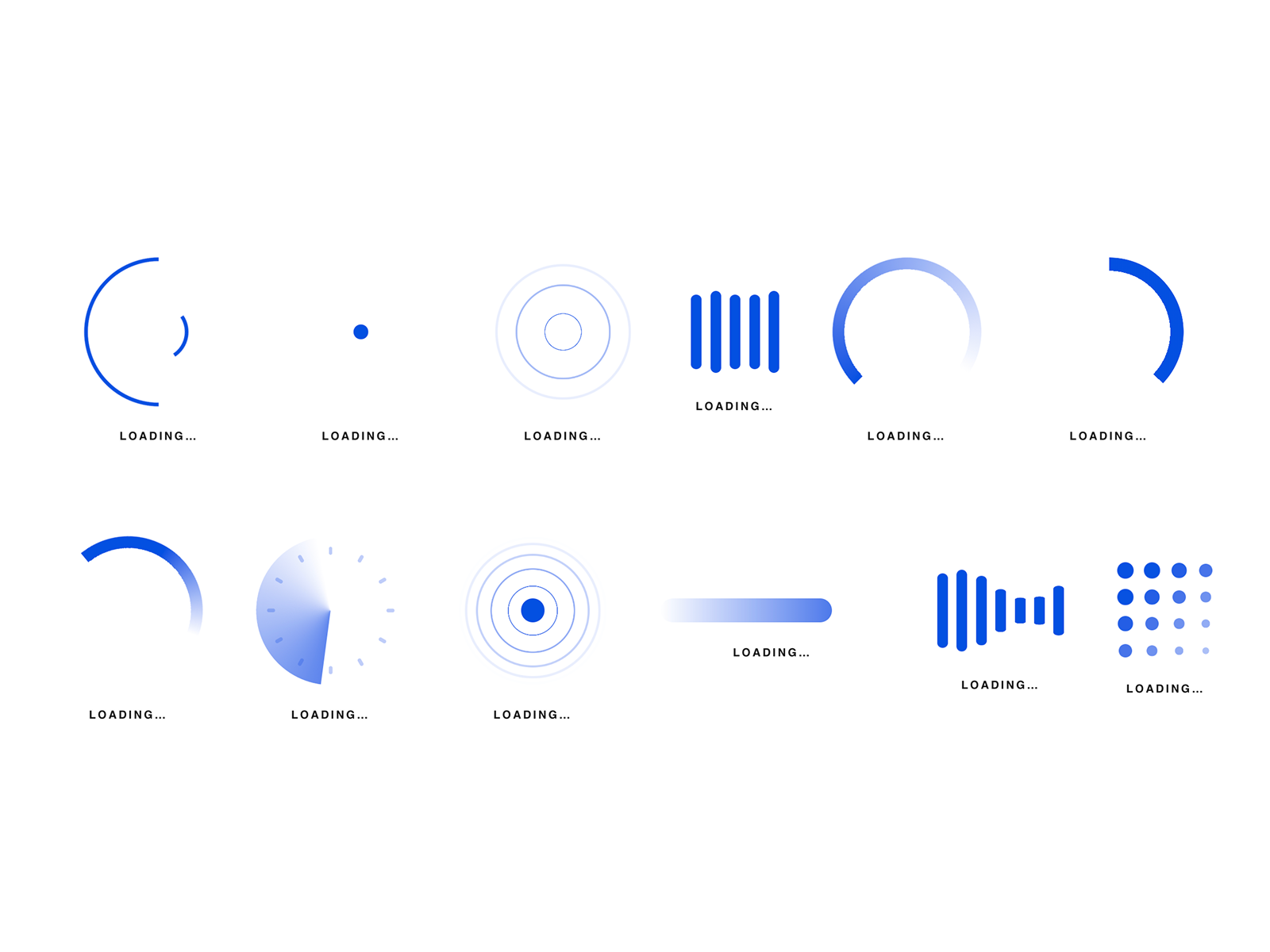
Loadly — 13 Animated Loaders in One Component Stop hunting for the right spinner.
Description
Loadly — 13 Animated Loaders in One Component Stop hunting for the right spinner. LoaderKit packs 13 hand-tuned loading animations into a single Framer component — pick one from a dropdown, set your colors, and you're done. Every style shares the same controls, so switching looks takes one click, not a new component. The 13 styles Fading Dots · Comet · Pulse Rings · Equalizer · Gradient Arc · Progress Ring · Dot Grid · Radar · Dual Rings · Arc Spinner · Ripple · Progress Bar · Wave Bars Why you'll love it - No code, ever. Drop it on the canvas and tweak everything from the properties panel. - 13-in-1. One dropdown switches between every style — try them all in seconds without adding layers. - Fits any theme. Two colors (Color + Track) drive the whole look; the defaults shine on dark UIs, but it works on any background. - Fully adjustable. Size, speed, and an optional uppercase label with its own color. - Light and smooth. Pure CSS animations, no libraries, no images — buttery even on mobile.
Introduction
One component, 13 loaders
Rank history
Daily rank per list, from the first snapshot — lower is better.
- All · #5429