Oddframe
Liquid Blob Button
FreeInteractive Liquid Blob CTA Button
Searching…
Free!
Free!
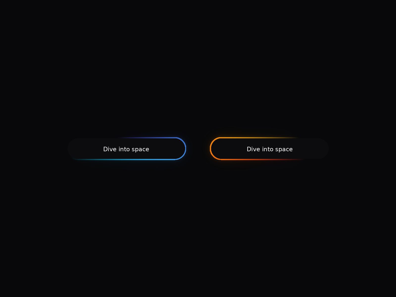
The button renders a two-color gradient streak that continuously travels along the pill-shaped border. It drops straight into your Framer project and every visual property is editable directly from the right panel. No code required after install.
Copy the component file into your Framer project's code components folder, or paste it directly into a new code component.
The component appears at a default size of 200 × 56. Resize it freely; the gradient and layout will adapt automatically.
Select the component and set the Link property in the right panel. It accepts internal Framer pages, external URLs, and anchor links.
Update the Text property to change the button label. Font family, size, and weight are all controlled through the Font property using Framer's native font picker.
All visual properties are in the right panel:Text, Font, Button color, Hover color, Text color, Gradient color, Border thickness, and Button padding.