component
Minimal Hover Navbar
By Matt
Details
- MattAuthor
- componentType
- 2026-09-07Published
- 2026-09-10Updated
- 2026-09-07Added
- NavigationCategories
Summary
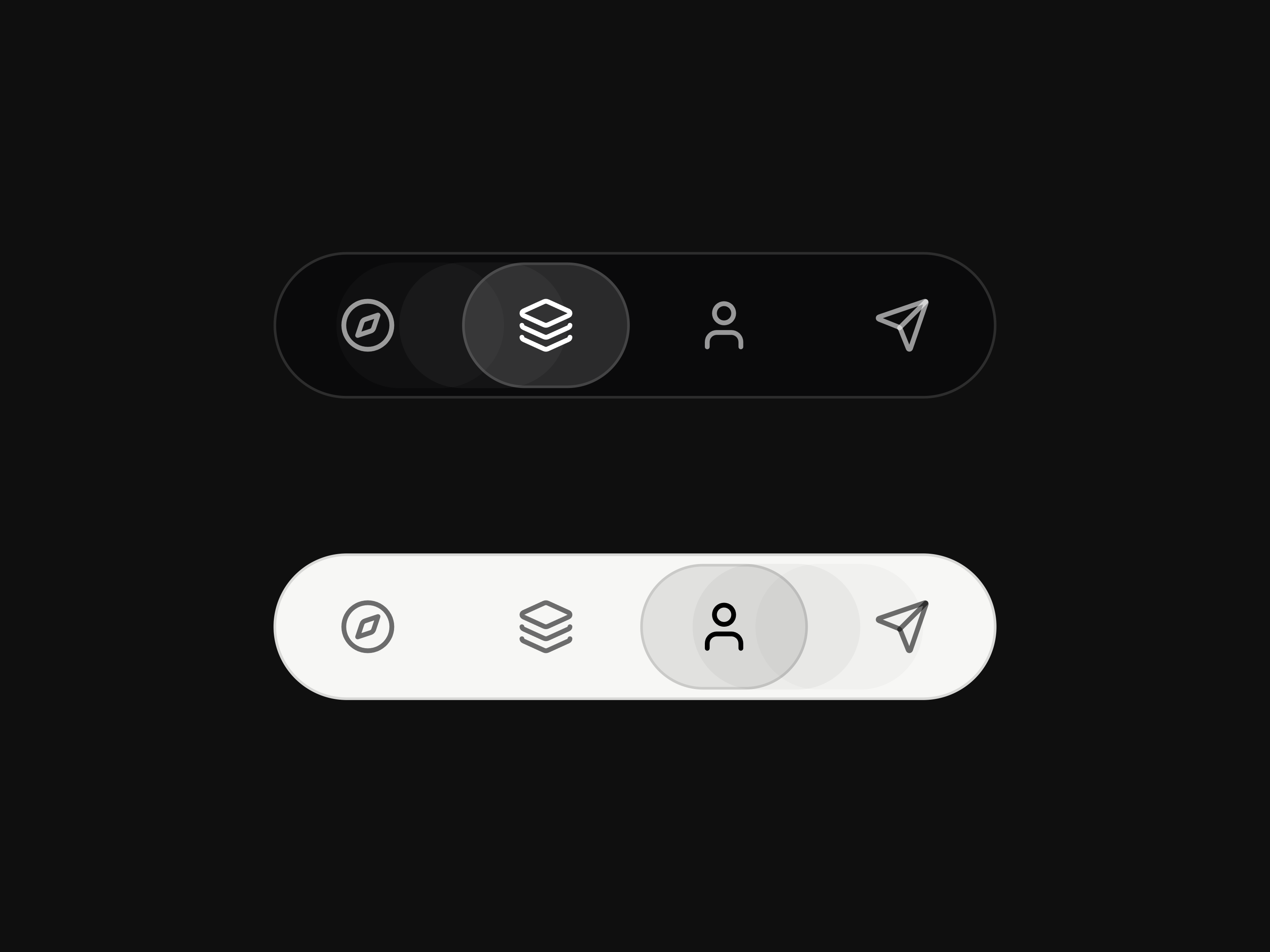
About Minimal Hover Navbar is a compact floating icon navigation that lets visitors move between page sections simply by hovering.
Description
About Minimal Hover Navbar is a compact floating icon navigation that lets visitors move between page sections simply by hovering. A smooth indicator glides between items while an intent delay prevents accidental scrolling and stops when the visitor takes control. Each item can also link to another page, section, or external destination. What you can customize Choose the light or dark theme, initial active item, destinations, and new-tab behavior. Built with native Framer elements, so you can also edit the icons, labels, colors, borders, spacing, active indicator, item count, and spring transitions. A lightweight included override powers the hover-based section scrolling. Great for (examples) Just a few ideas, use it anywhere you need compact hover navigation or smooth section scrolling: Hover navigation and smooth scrolling Section navigation and one-page websites Floating, fixed, and sticky navbars Minimal icon and pill navigation Creative portfolios and personal websites Designer and developer portfolios Agency and design studio websites SaaS and product landing pages Case studies and editorial showcases Affiliate and component demonstrations Dark and light website interfaces Desktop, tablet, and mobile layouts Premium Framer templates Share your build If you ship something cool with it, post it on X and tag me @Matthias_Oel , or send it over. I’d love to see what you create. Need help? Questions or feedback? Reach me anytime: matthias@lmvision.de or on X @Matthias_Oel. Need a matching component? Explore more navigation components for your next project: Magnet Side Navbar → Motion Hamburger → Explore all components →
Introduction
Let the cursor guide the page
Rank history
Daily rank per list, from the first snapshot — lower is better.
- All · #668