component
Minimal Navbar
By Luqman
Details
- LuqmanAuthor
- componentType
- 2026-06-25Published
- 2026-07-07Updated
- 2026-06-25Added
- NavigationCategories
Summary
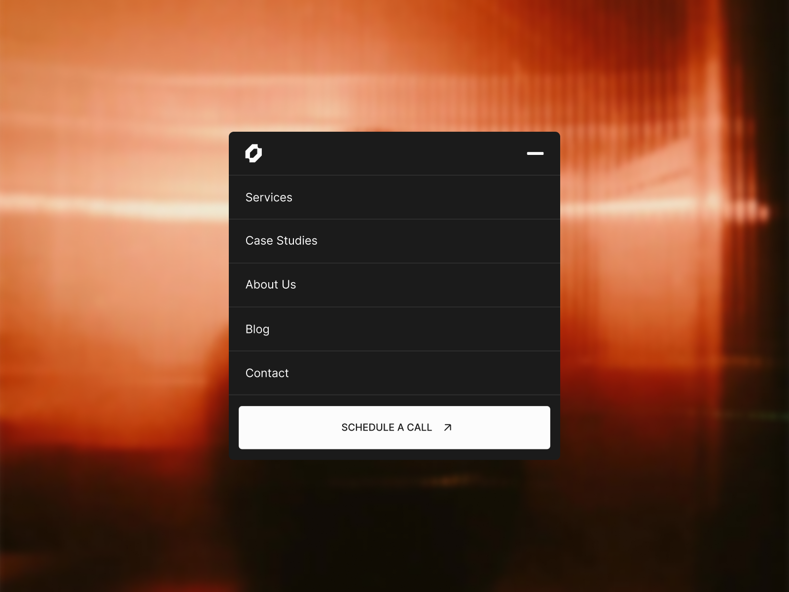
Minimal Navbar is a clean, distraction-free navbar with a blur backdrop on open and smooth micro-animations that just feel right.
Description
Minimal Navbar is a clean, distraction-free navbar with a blur backdrop on open and smooth micro-animations that just feel right. Features Blur backdrop with smooth open and close behaviour. Click Outside to Dismiss — Click outside the navbar to close it; no need to reach for the menu button. Framer-native — no code components, no dependencies, and fully customizable to match your brand. Clearly named layers so you can find your way around instantly if you choose to edit the component. Responsive out of the box so it looks right on every device your visitors land on. How to Use The component you receive is the Backdrop + Navbar — the Navbar lives inside it, so you only need to drop in one component to get the full setup. Setting up the Backdrop Select the Backdrop component and set: the Position Type to Fixed, Anchored to 0 on Top, Right, and Left Height to 100vh (Viewport) This ensures that the blur and click effect covers the full screen when the menu opens. Also remmber to set: Pointer Events to None, so that the backdrop does not block pointer events behind it. The Navbar Already inside the Backdrop, no extra setup needed. It sits full width by default with a max width of 440px , and centered. To edit the max width of the navbar or to use Nabar separately , unlink the component and customize accordingly. Need Help? Have a question or running into an issue? Drop a comment below or reach out via email at: luqmankm12@gmail.com NOTE: The bakcground image on the preview site is a photo sourced from Cosmos . If you are the owner and would like it removed, please reach out.
Introduction
A clean navbar with blur backdrop.
Rank history
Daily rank per list, from the first snapshot — lower is better.
- All · #2000