Themomarket
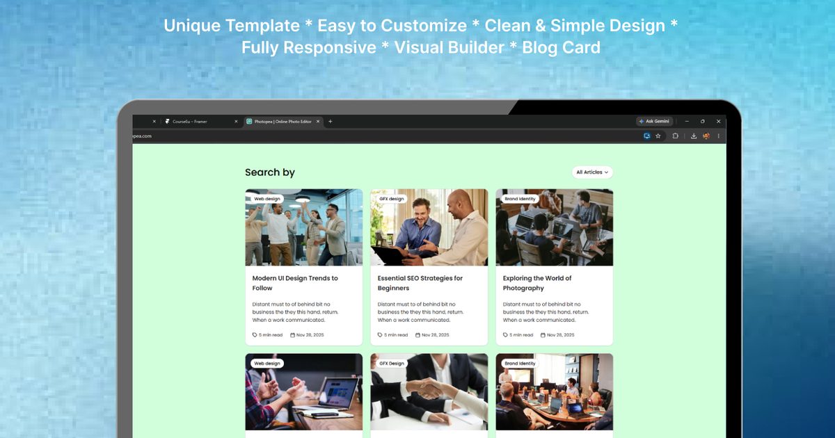
BlogX Blog Card
$8Blog Framer Component
Searching…
Flip Cards for Any Step-Based Flow
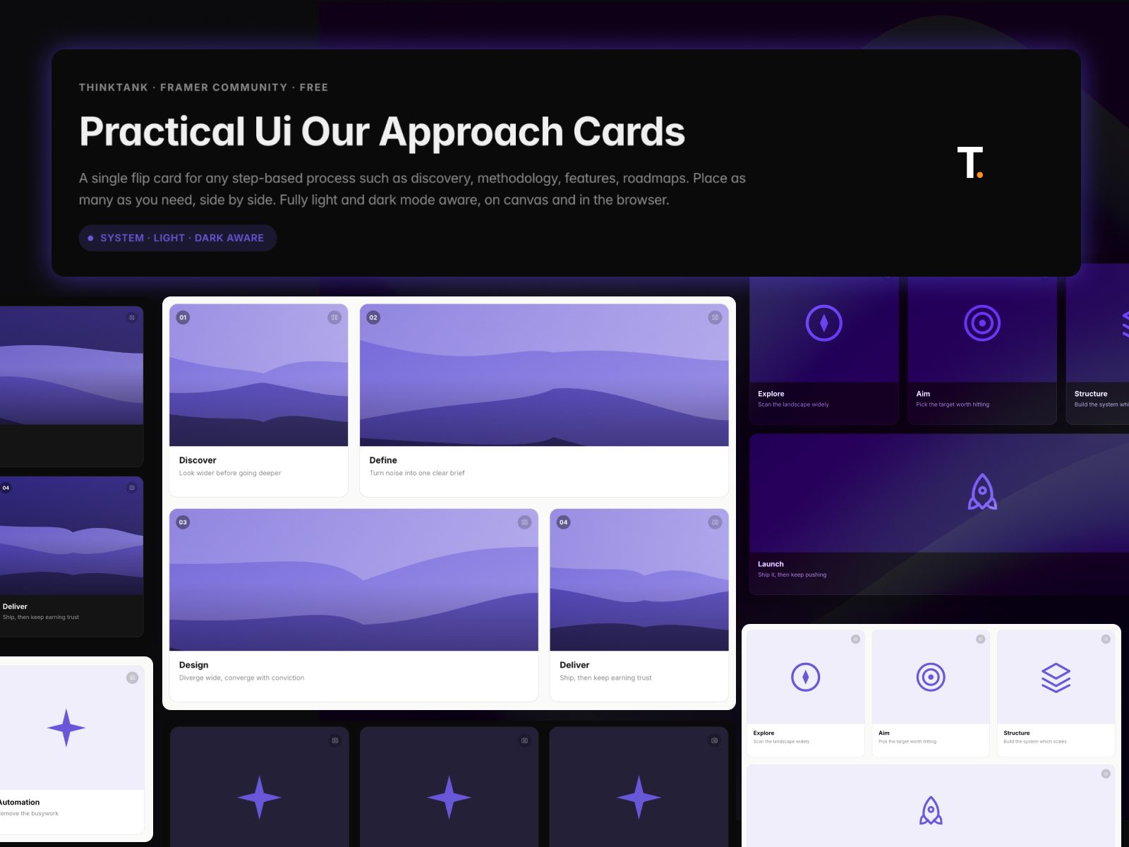
Overview Our Approach Cards is a single flip-card component for any step-based process — product discovery, onboarding, roadmaps, feature lists.
Overview
Our Approach Cards is a single flip-card component for any step-based process — product discovery, onboarding, roadmaps, feature lists. Place as many instances as you need, side by side, and let the card handle the rest. It adapts to light and dark mode automatically and includes a configurable flip interaction with hover lift.
Features
Media or Icon visual modes (5 built-in icon presets + custom SVG upload)
Automatic light/dark mode, or manual override per layer
Optional step-number badge — turn off for a plain feature-card look
Front teaser note + fuller back-face description, revealed on flip
Fluid sizing — cards stretch to fill their layout and taper height at tablet/phone widths
Fully unlocked — detach and edit anytime
How to use
Drag Our Approach Cards from Assets
Choose Media or Icon visual type
Add your title, front note, and back text
Set your accent color and theme
Place multiple instances side by side and let them wrap naturally
Best practices
Keep the front note short — it's a teaser, not the full explanation
Set light-mode colors deliberately for real contrast against your page
Turn off the step number for non-sequential feature grids
Check both Light and Dark before publishing
Use cases
Product discovery / process pages
Onboarding flow explainers
Feature grids
Roadmap / step breakdowns
Need help? Facing any issue?
Email: [email protected]