component
Practical Doc Blocks
By ThinkTank.
Details
- ThinkTank.Author
- componentType
- 2026-07-15Published
- 2026-07-15Updated
- 2026-07-15Added
- ButtonsCategories
Summary
Content Blocks for Docs & Guides
Description
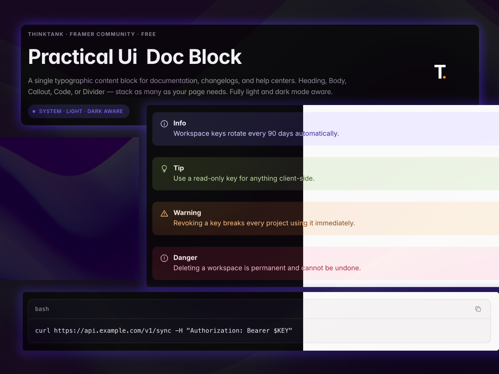
A single typographic content block for documentation, changelogs, and help centers. Heading, Body, Callout, Code, or Divider — stack as many instances as your page needs. Fully light and dark mode aware, with a color-aware code block and one-click copy. Overview Practical Ui — Doc Block is a single typographic content block for documentation, changelogs, and help centers. Switch between five block types — Heading, Body Text, Callout, Code, and Divider — and stack as many instances as your page needs. Fully light and dark mode aware. Features Five block types in one component: Heading, Body Text, Callout, Code, Divider Automatic light/dark mode, or manual override Four semantic callout types — Info, Tip, Warning, Danger — each with its own fixed tint and icon Code blocks with a language label and one-click copy Single Max Width control keeps line length readable at any container width Full color control — Accent, Text (Primary/Secondary/Muted), Border Fully unlocked — detach and edit anytime How to use Drag Doc Block from Assets Choose a Block Type — Heading, Body, Callout, Code, or Divider Fill in the fields for that type Set Max Width and Theme Stack more instances to build out the full page Best practices Keep callout text short and scannable — one idea per block Use Danger sparingly, only for genuinely irreversible actions Match your light-mode text/border colors to your site — dark mode is handled automatically Check both Light and Dark before publishing Use cases Documentation pages Changelogs and release notes Help centers and knowledge bases Any long-form page that needs consistent structure Need help? Facing any issue? Email: tankchaitanya23@gmail.com
Introduction
Content Blocks for Docs & Guides
Rank history
Daily rank per list, from the first snapshot — lower is better.
- All · #5395