component
Prism Drift
By Artem Kireev
Details
- Artem KireevAuthor
- componentType
- 2026-08-12Published
- 2026-08-12Updated
- 2026-08-12Added
- BackgroundsCategories
Summary
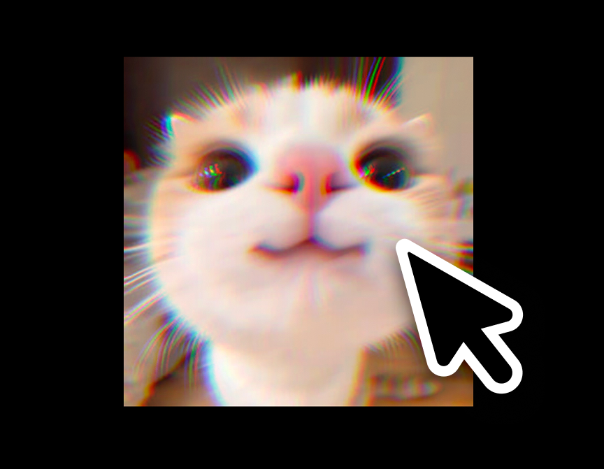
RGB channels, torn apart on purpos
Description
Customizations available Image — optional source photo/graphic. Leave empty to use the built-in animated gradient instead. Overlay — optional layer (headline, logo, button) rendered centered on top of the canvas. Trigger — Hover, Always on, Scroll into view, or Click to toggle; swaps the interaction pattern entirely. Split Amount — max RGB channel offset in pixels at full effect. Angle — direction the channels split apart, in degrees. Noise / Grain — amount of organic jitter in the split plus a fine film-grain overlay. Speed — playback speed of the shader's internal animation. Ease — how quickly the effect ramps in and out when the trigger changes. Grayscale Base — desaturates the source before splitting, for a more graphic look. Idle Drift + Idle Amount — subtle always-on wobble so the effect never looks frozen at rest, independent of the chosen trigger. Gradient 1 / 2 / 3 — the three colors used for the procedural background whenever no Image is set. Radius — corner rounding, to match the surrounding layout. Motion — Auto (respects the visitor's OS reduced-motion setting), Always Animate, or Always Static, so accessibility is a control rather than an afterthought. Use cases A chromatic-glitch hover state on project thumbnails in a design portfolio. An animated gradient hero background behind a headline on a product landing page, intensifying as the visitor scrolls it into view. A click-to-toggle "glitch reveal" on a case-study cover image, or a subtle always-on shimmer on a brand mark for an editorial, motion-forward feel.
Introduction
RGB channels, torn apart on purpos
Rank history
Daily rank per list, from the first snapshot — lower is better.
- All · #3268