component
Progress Circle Bars
By Ahmet Loca
Details
- Ahmet LocaAuthor
- componentType
- $5.00Price
- 2026-06-26Published
- 2026-07-29Updated
- 2026-06-26Added
- InteractiveCategories
Summary
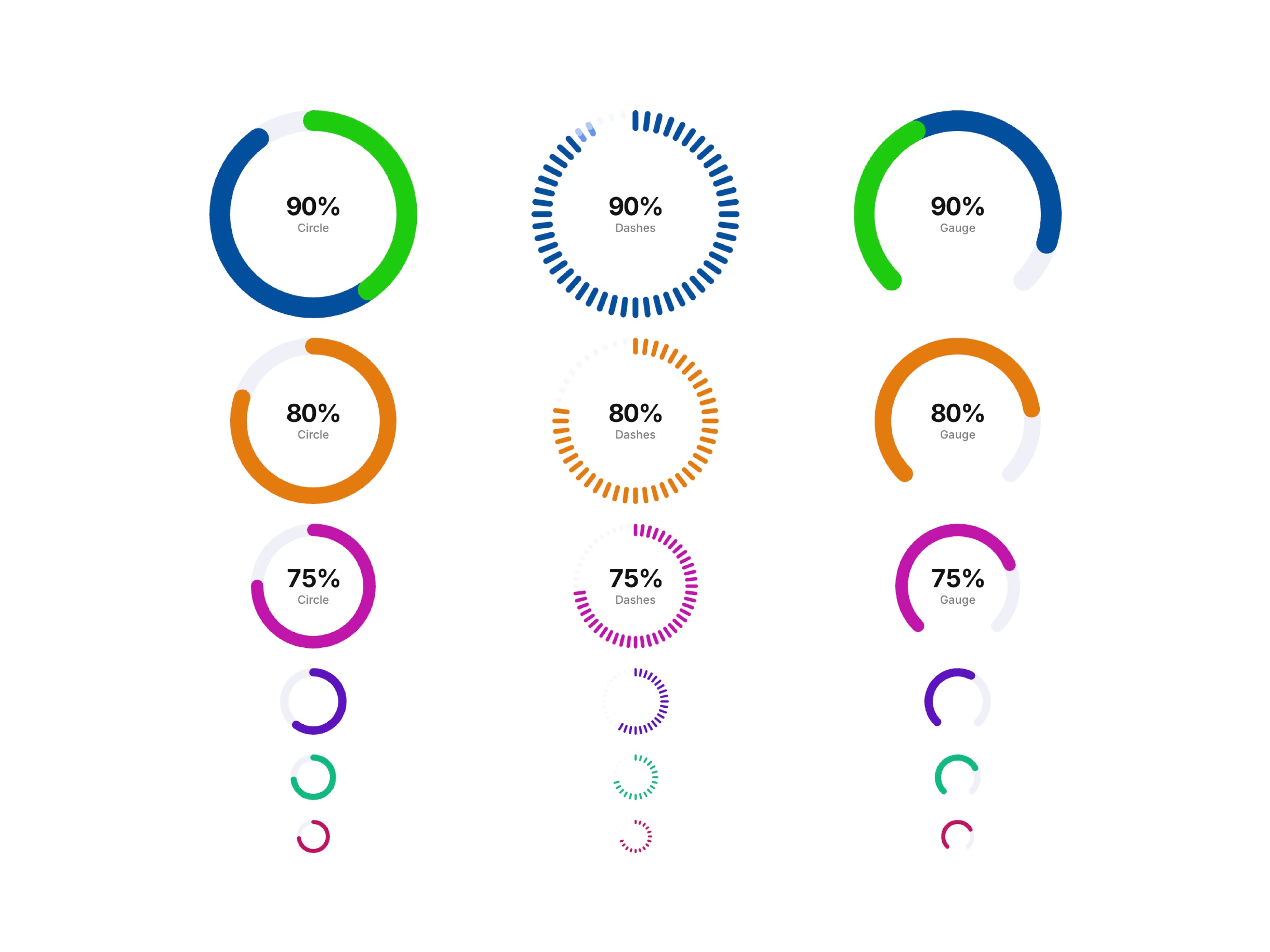
Progress Circle Bars is a set of animated circular progress indicators for Framer, with three distinct ring styles — solid Circle, segmented Dashes, and a half-round Gauge — all…
Description
MORE FRAMER COMPONENTS LIKE THIS ✦ Browse +38 FREE + 85 premium components: https://frameze.com/components ✦ Get everything for one price: https://ahmetloca.dub.link/allcomponents About Progress Circle Bars Progress Circle Bars is a set of animated circular progress indicators for Framer, with three distinct ring styles — solid Circle, segmented Dashes, and a half-round Gauge — all showing a centered percentage and label. Each ring animates its fill on scroll, comes in multiple sizes and colors, and drops straight into dashboards, stat sections, or skill/proficiency displays. Features 3 ring styles: solid Circle, segmented Dashes, and half-round Gauge Centered percentage value with label text Scroll-triggered fill animation Multiple sizes, from compact icon-scale rings to large hero stats Custom stroke color and track (background) color per ring Adjustable stroke width and corner cap style Works out of the box — no setup needed Use Cases Dashboards and analytics pages Skill and proficiency indicators on portfolio sites Health, fitness, and habit-tracking apps Onboarding and setup completion indicators Storage and quota usage displays Survey and quiz result summaries Keywords progress circle, circular progress bar, gauge component, radial progress, percentage ring, animated progress ring, framer dashboard component, stat ring, dashes progress indicator, skill indicator, loading ring, progress gauge
Introduction
Progress circles: ring & gauge
Rank history
Daily rank per list, from the first snapshot — lower is better.
- All · #1072