component
Progress Indicator
By Teddesign
Details
- TeddesignAuthor
- componentType
- $6.00Price
- 2026-09-09Published
- 2026-09-10Updated
- 2026-09-09Added
- SectionsCategories
Summary
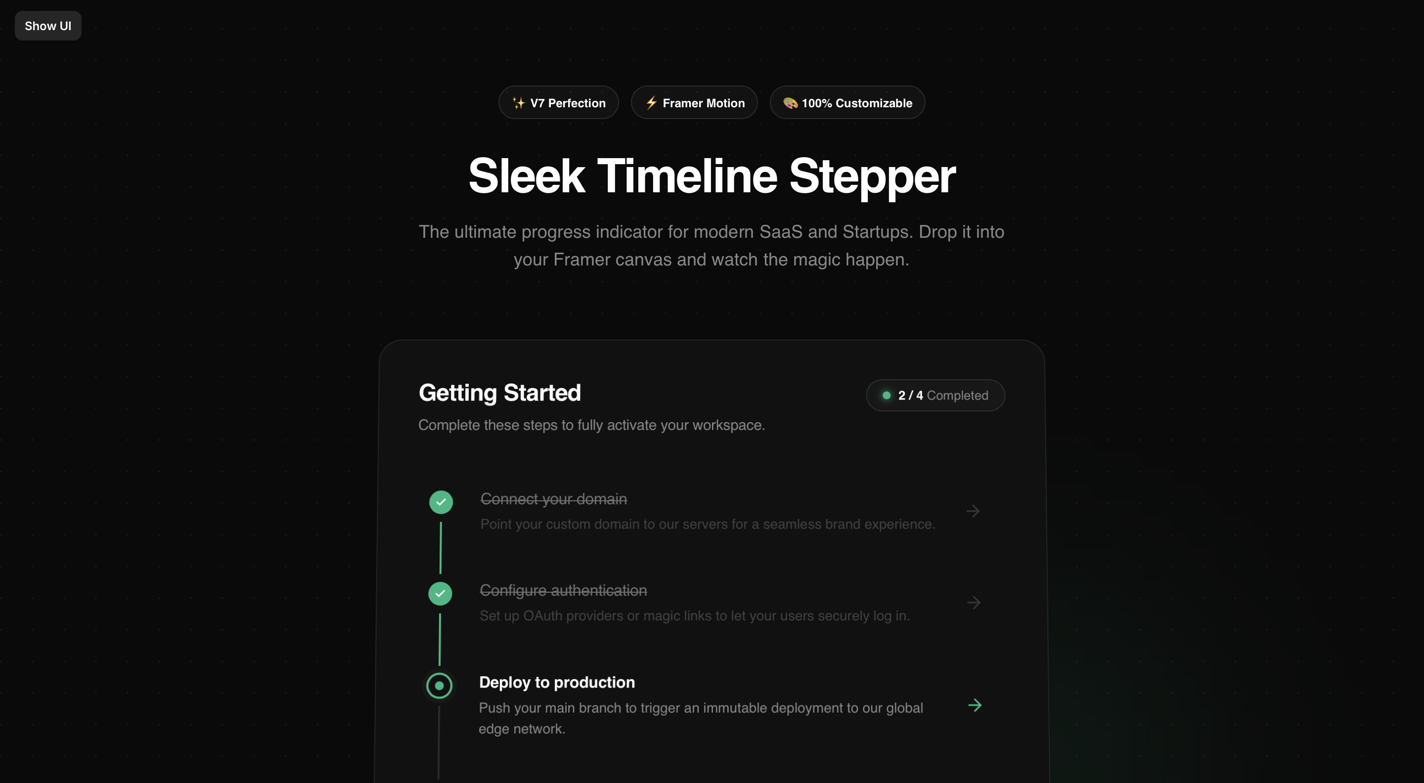
The Progress Indicator component is a highly-polished, Linear-style vertical timeline designed for modern SaaS, Startups, and Dashboards.
Description
Elevate your onboarding experience with the Sleek Timeline Stepper. Stop using boring checklists. The Progress Indicator component is a highly-polished, Linear-style vertical timeline designed for modern SaaS, Startups, and Dashboards. Built meticulously with Framer Motion, it guides your users through a beautiful journey with buttery-smooth micro-interactions. ✨ Premium Features: - Smart Auto-Active Logic: No complex wiring needed. Just toggle "Completed", and the component automatically calculates the next "Active" step. - Dynamic Pill Badge: A beautiful glassmorphic progress counter that updates in real-time. - 100% Fully Customizable: Customize outer wrapper radii, border widths, shadows, typography scale, and granular padding right from the Framer panel. - Zero Code Needed: Drop it in and edit the checklist array.
Introduction
Sleek timeline stepper component.
Rank history
Daily rank per list, from the first snapshot — lower is better.
- All · #7997