Frame Native
Particle Team Cards
FreePortraits that move as particles
Searching…
Built for modern real estate interfaces
Built for modern real estate interfaces
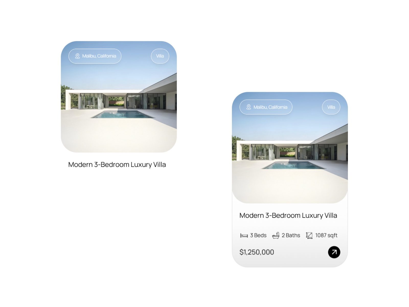
Hover or tap to extend the card — designed to reveal property details only when needed, keeping the interface clean and focused. Perfect for layouts where visuals take priority and data stays secondary until interaction.
A clean, interaction-driven property card that expands smoothly to reveal key details like price, specs, and actions. The default state highlights the property image, while hover (desktop) or tap (mobile) reveals additional information with a subtle, seamless transition.
Built using a visual layout enhanced with lightweight code overrides for smooth, responsive interaction across devices.
Hover to expand on desktop, tap to expand on mobile
Smooth reveal animation with subtle elevation and scaling
Image-first layout for a clean visual hierarchy
Expanded state shows title, property details, and pricing
Built-in property stats (beds, baths, area)
Minimal design with progressive content reveal
Fully customizable via Framer properties
Lightweight and performant
Real estate property listings
Property showcase sections
Landing pages with featured listings
Portfolio or case study cards
Product cards with hidden details
Content-heavy layouts that need visual clarity
Designers who want clean, interactive card layouts without clutter
Developers looking for a ready-to-use expandable card
Creators building modern, minimal UI systems in Framer
Drag the component onto your Framer canvas
Add your property image, title, and details
Adjust values like price, stats, and labels
Customize styling (colors, radius, layout)
Preview hover (desktop) or tap (mobile) interaction
Publish — your interactive property card is ready