component
Reveal Card
By Mosopefoluwa Afolayan
Details
- Mosopefoluwa AfolayanAuthor
- componentType
- $9.00Price
- 2026-06-23Published
- 2026-06-29Updated
- 2026-06-23Added
- CardsCategories
Summary
Expand any content. No variants.
Description
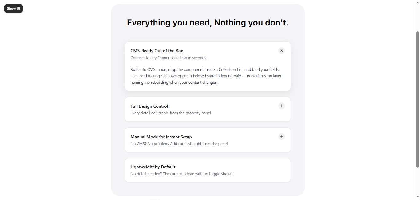
RevealCard — Expandable Cards. Manual or CMS. A fully interactive expand/collapse card component built for SaaS sites, feature pages, integration directories, FAQ sections, and use case grids. Two modes. Zero setup. Switch between Manual and CMS mode from a single toggle in the property panel. Manual mode — click Add Item, fill in your content, done. No Collection List, no CMS setup, no canvas editing required. CMS mode — drop inside a Collection List and bind your fields. Each card manages its own open/closed state independently — no variant duplication, no layer naming. Fully customisable from the panel Font family, size, weight, and color — separately for title, summary, and detail Icon size, radius, and background Card background, border color, corner radius, and padding Accent color for links and highlights Allow one or multiple cards open at once Start expanded option Smart empty states Cards with no detail content automatically disable their toggle — no broken interactions, no empty expand areas. Works everywhere Responsive out of the box. Resize using Framer's native controls.
Introduction
Expand any content. No variants.
Rank history
Daily rank per list, from the first snapshot — lower is better.
- All · #7361