component
Running Dashed Line
By Fizi Lee
Details
- Fizi LeeAuthor
- componentType
- 2026-06-22Published
- 2026-07-24Updated
- 2026-06-22Added
- ButtonsCategories
Summary
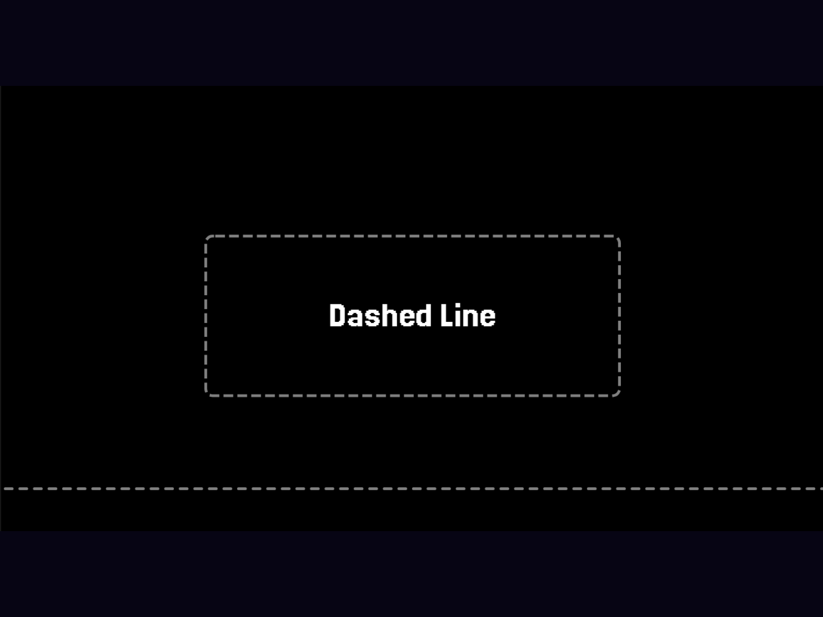
Dashed Line & Border for Card
Description
How to Use Drag the component onto your canvas. Choose a Style : Border – Displays an animated dashed border around the frame. Line – Displays an animated dashed line. Customize the dash appearance using Dash Length and Gap Length . Adjust the animation speed with the Speed control. Change colors for the border, line, and hover states. Enable Solid on Hover to transform the dashed stroke into a solid line when hovered. For line mode, use Line Cap to switch between Butt, Round, and Square endings. Resize the layer freely to fit your design. Perfect for buttons, cards, dividers, highlights, and interactive UI elements.
Introduction
Dashed Line & Border for Card
Rank history
Daily rank per list, from the first snapshot — lower is better.
- All · #2067