component
Scatter Cards
By Roman Koby
Details
- Roman KobyAuthor
- componentType
- $8.00Price
- 2026-07-08Published
- 2026-08-18Updated
- 2026-07-08Added
- CardsCategories
Summary
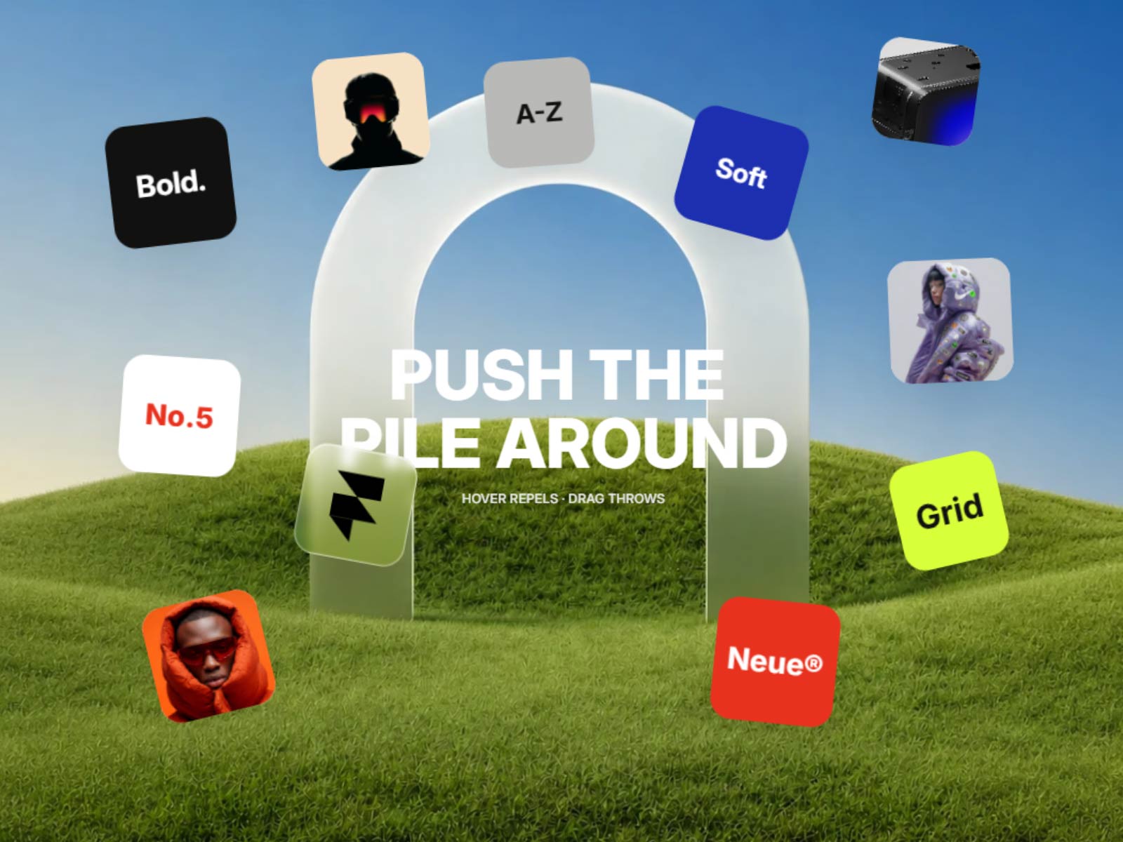
Interactive Draggable Cards
Description
MORE COMPONENTS → Cards react to cursor hover, bounce inside the container, separate from each other, and can be thrown around by drag. Supports text cards, image cards, glass effect, shadows, custom colors, typography, background image, and animated center text. Works well for hero sections, portfolios, landing pages, moodboards, product showcases, and creative interactive blocks. Key features Interactive card physics Hover repel effect Drag and throw movement Text and image cards Glass effect support Custom colors, fonts, size, corners, and shadows Background image and opacity controls Animated center title and subtitle Support For help or questions, contact: promakdesign@gmail.com
Introduction
Interactive Draggable Cards
Rank history
Daily rank per list, from the first snapshot — lower is better.
- All · #1548