component
Scroll arrow
By Gyte Tama
Details
- Gyte TamaAuthor
- componentType
- 2026-06-17Published
- 2026-06-17Updated
- 2026-06-17Added
- SectionsCategories
Summary
Disappear the arrow with scroll
Description
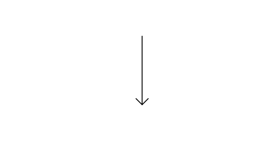
Scrolling Arrow A scroll-driven arrow indicator that shrinks as the user moves down the page - a subtle, satisfying cue that there's more to explore. The arrow starts at full length and its tail gradually draws upward toward the tip as the page scrolls, disappearing entirely when the bottom is reached. Motion is spring-smoothed for a natural, physical feel rather than a mechanical linear fade. Features Scroll-linked animation tied to full-page progress Spring physics for smooth, natural motion Auto-hides at the end of the page Fully visible in the Framer canvas for easy positioning Zero layout impact — non-interactive and pointer-events free Property Controls Color - match any brand or design system Max Length - controls how tall the arrow starts (50–800px) Thickness - stroke weight of the line and tip (1–20px) Arrow Tip Size - scales the arrowhead independently (5–100px) Scale - uniform scale override (0.1–2×) Best used on hero sections, landing pages, and long-scroll layouts where you want to invite the user downward without a distracting UI element.
Introduction
Disappear the arrow with scroll
Rank history
Daily rank per list, from the first snapshot — lower is better.
- All · #533