component
Sectors donut
By Savva Sicevs
Details
- Savva SicevsAuthor
- componentType
- 2026-08-05Published
- 2026-08-24Updated
- 2026-08-05Added
- ChartsCategories
Summary
Allocation ring with hover isolate
Description
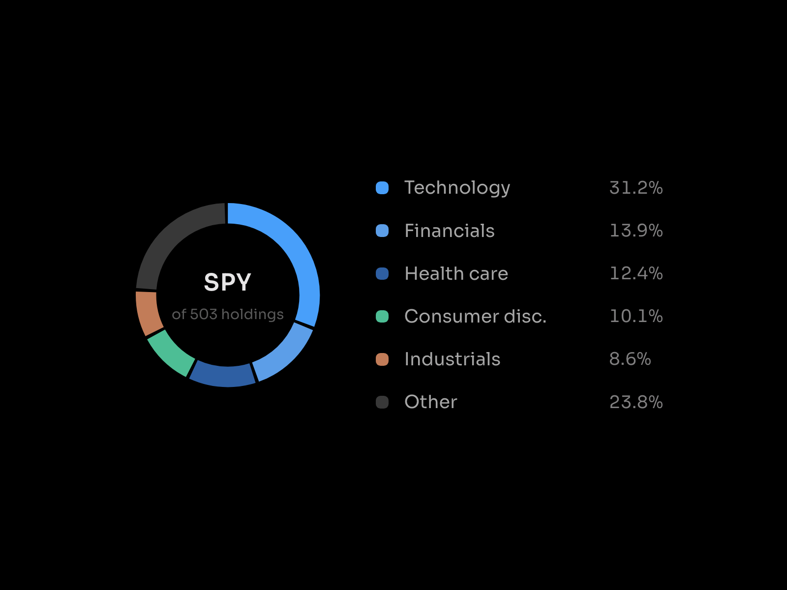
A sector allocation ring. Weights become arcs around a centered symbol, with legend rows down the right, and hovering either an arc or a row dims everything else so one weight reads at a time. What it does Arc per weight. Arc length is that sector's percentage of the ring, so the geometry is the data. Two way hover. Hover a legend row to isolate its arc, or hover the arc to isolate its row. Both directions work. Centered label. The symbol sits in the hole with a caption line under it, for example "SPY" over "of 503 holdings". Ring thickness. 6 to 20 px. Thin reads as a chart, thick reads as a graphic. Staggered draw in. Arcs sweep in one after another on first paint. Reduced motion users get the finished ring. Best for Portfolio and fund pages, ETF and index products, allocation and breakdown sections, and any place a pie chart would normally go but needs to look built rather than generated. How to use 1. Drop it on the canvas. It wants enough width for the ring and the legend side by side. 2. Set the Symbol for the middle, and the Caption underneath it. 3. Set Thickness between 6 and 20 for the ring weight. 4. Pick a Theme and Accent. 5. Hover arcs and legend rows in preview to confirm the isolate reads clearly at your size. The sector weights are sample data. Edit them in the code file to show your own allocation.
Introduction
Allocation ring with hover isolate
Rank history
Daily rank per list, from the first snapshot — lower is better.
- All · #4259