component
Semi Progress Bar
By Elemis Themes
Details
- Elemis ThemesAuthor
- componentType
- 2026-09-08Published
- 2026-09-08Updated
- 2026-09-08Added
- ChartsCategories
Summary
Animated Semi Progress Bar
Description
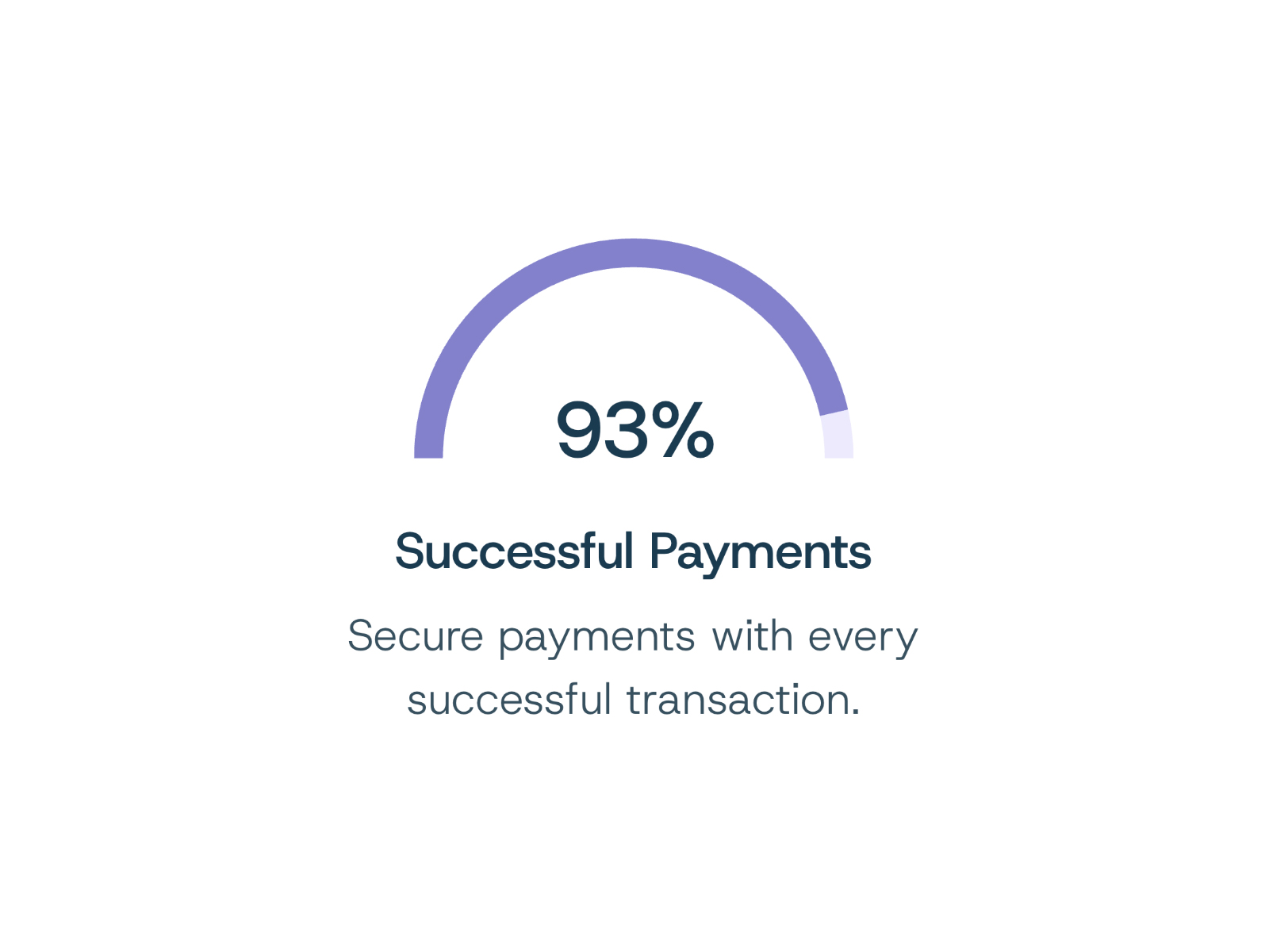
🔗 Live preview → 👉 Browse more free templates → A clean, animated semi-circle progress component with customizable colors, typography, and content. The progress animates when it enters the viewport and includes adjustable timing and animation controls. Features: • Animated semi-circle progress indicator with percentage counter • Adjustable progress value from 0–100% • Customizable animation duration and delay • Viewport-triggered animation with adjustable InView Amount • Customizable progress and track colors • Optional percentage sign • Editable title and description • Independent font controls for percentage, title, and description • Adjustable text and subtitle colors • Adjustable stroke thickness • Independent width controls for the progress indicator and text content • Adjustable spacing between the progress and text • Vertical offset control for the percentage label
Introduction
Animated Semi Progress Bar
Rank history
Daily rank per list, from the first snapshot — lower is better.
- All · #1349