Brandon Grimes
Sale Bar
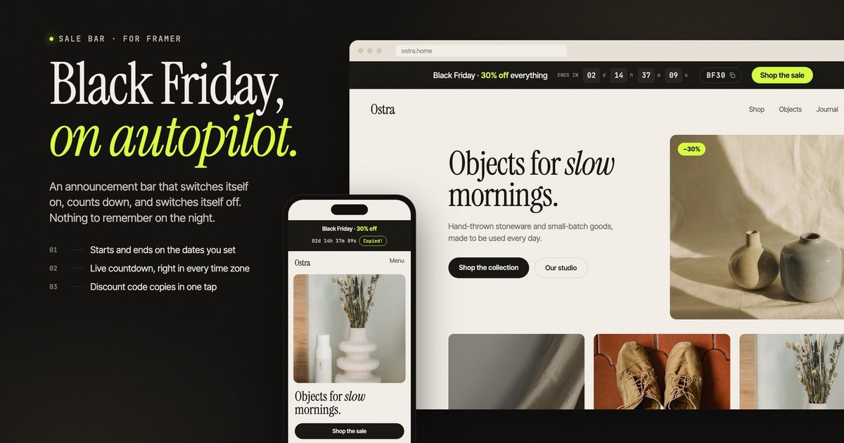
$12Auto-start Black Friday promo bar
Searching…
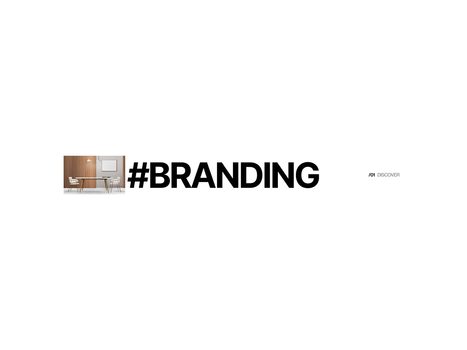
This component is designed to help creators instantly communicate their core services or categories using bold, high-impact typography.
This component is designed to help creators instantly communicate their core services or categories using bold, high-impact typography. The layout is intentionally minimal, allowing your message to stand out while maintaining a premium visual aesthetic. Ideal for hero areas, section headers, and portfolio highlights, it adapts seamlessly to any brand style. Easily customize the text, image, spacing, and alignment to fit your project and create a strong first impression.