component
Services Hover Pro
By Septianto
Details
- SeptiantoAuthor
- componentType
- 2026-07-02Published
- 2026-09-15Updated
- 2026-07-02Added
- TextCategories
Summary
Premium Services Section Component
Description
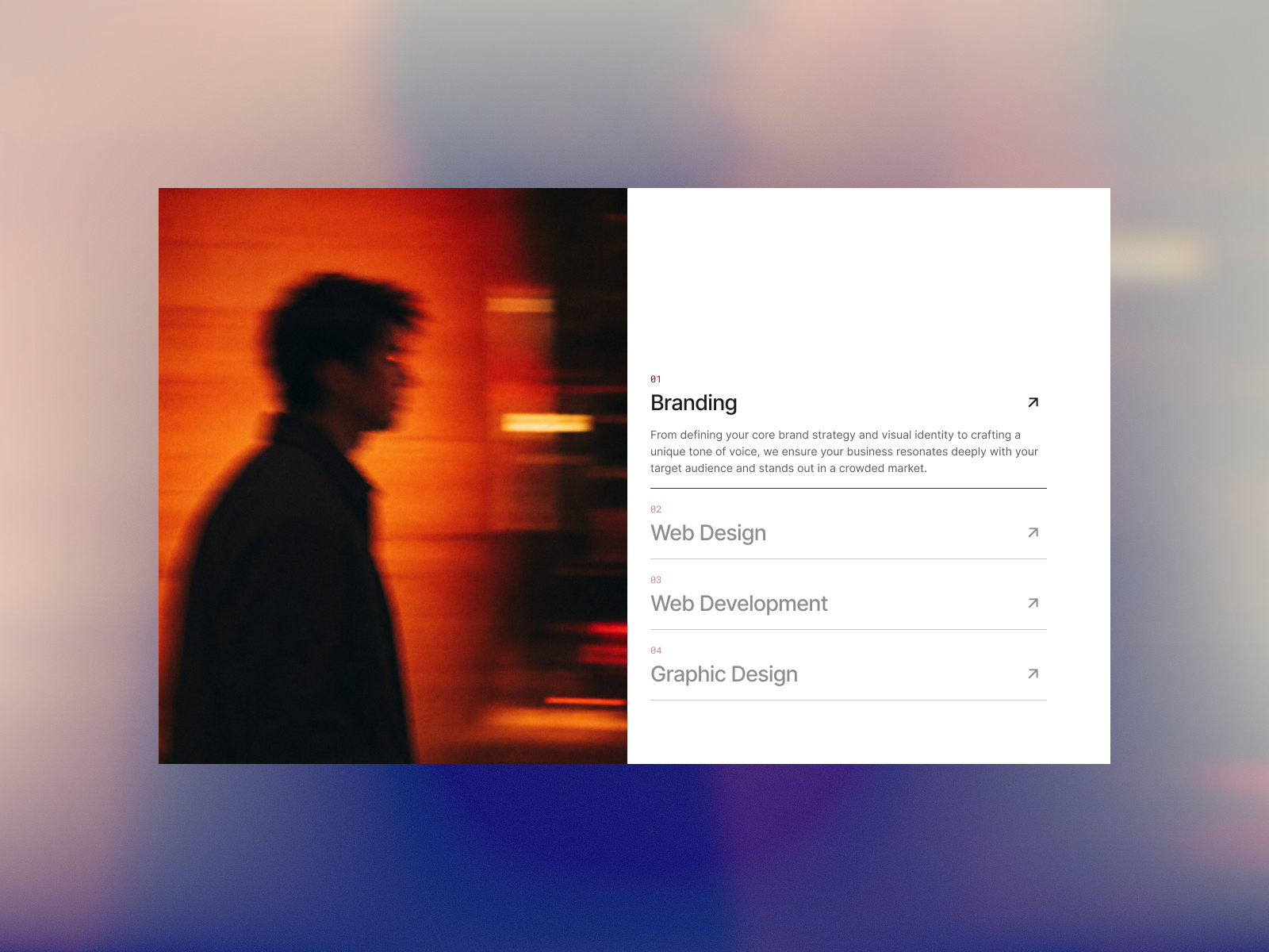
Designed with a clean, minimal concept, the left side image changes instantly and dynamically as users hover over each service giving your content a clear visual hierarchy without cluttering your layout. Features & Customization Images: Swap the left-side images to match each service. Custom Numbering: Use sleek numbers (01, 02, 03) or icons. Text & Typography: Easily edit titles, descriptions, and font sizes. Colors: Full control over text, backgrounds, and hover states. Layout & Spacing: Fine-tune internal padding for a perfect fit. Interactions: Pre-configured fluid hover and micro-interactions. Fully Responsive: Looks stunning on Desktop, Tablet, and Mobile. Zero Code: Just copy, paste, and customize in minutes. How to Use Add the Component: Simply add the component directly to your layout. Customize Spacing: You can use the built-in padding properties inside the component to adjust the spacing right away. Pro-Tip (Optional): While the component works perfectly on its own, placing it inside a container wrapper gives you even more precise control over the outer margins and layout alignment.
Introduction
Premium Services Section Component
Rank history
Daily rank per list, from the first snapshot — lower is better.
- All · #762