Lera
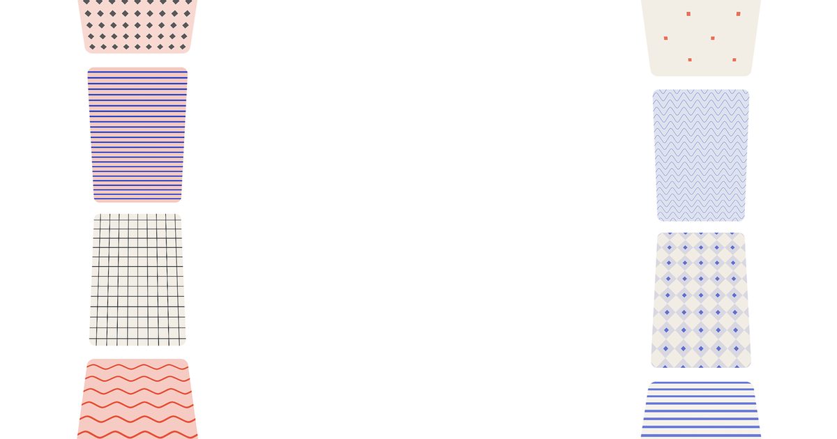
3DCurvedImageMarquee
$4Curved perspective double ticker
Searching…
Slider with Card Shuffling Effect.
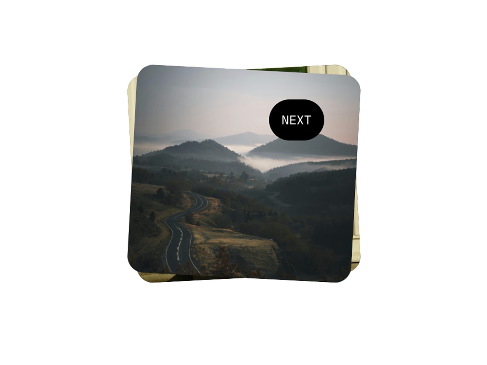
Slider with Card Shuffling Effect.
Transform your content showcase with this unique stacked card component. Cards alternate rotation angles and shuffle through with elegant exit and elastic return animations, while a custom cursor follows your mouse on desktop for a premium interactive feel.
Unique Shuffle Animation: Top card exits with flatten animation, repositions to back, returns with elastic spring
Custom Follow Cursor: Smooth cursor with customizable text, colors, and styling (desktop only)
Alternating Rotations: Cards automatically rotate left/right in an alternating pattern for visual interest
Click Anywhere: Entire component is clickable - no need to hunt for buttons
Queue Support: Multiple rapid clicks queue up and execute smoothly
Smooth Animations: Exit with realistic easing, elastic return spring, and press feedback
Responsive Design: Custom cursor on desktop (>810px), clean tap interaction on mobile
10+ Property Controls: Complete customization without code
Creative portfolios, testimonial showcases, product features, team member profiles, case study highlights, image galleries, service offerings, design showcases
Production-ready Framer component
Native Framer property controls (no code files needed)
Custom cursor with spring physics
Responsive desktop/mobile behavior
Smooth Framer Motion animations
Professional default styling
Add component to your canvas
Connect components or layers as cards (click + to add more)
Customize cursor text, colors, and styling
Adjust rotation angle and card gap
Done! Click anywhere to shuffle
Card Appearance: Rotation angle (0-15°, alternates automatically), stack gap (0-50px vertical spacing) Custom Cursor (Desktop): Text content, background & text colors, font size (10-32px), padding (0-30px), full typography control Animation: Exit distance (1-2× card width), animation speed (0.1-1s exit, 1s return with elastic spring)
Shuffle Sequence:
Top card flattens (rotation → 0°) and exits left or right
Card instantly repositions to back of stack (off-screen)
Card returns with elastic spring to its permanent rotation
Direction alternates: right, left, right, left...
Queue handles rapid clicks smoothly
Custom Cursor:
Follows mouse with spring physics (smooth, natural lag)
Fades in/out smoothly (200ms)
Press effect scales to 85% on click
Only visible within component boundaries
Disabled on mobile (≤810px)
Permanent rotation per card (alternates left/right based on index)
Exit: 0.2s with Power2.easeOut equivalent
Return: 1s elastic spring (stiffness: 100, damping: 10)
Z-index automatically managed throughout animation
Cursor uses spring physics (stiffness: 500, damping: 28)
Mobile breakpoint: 810px
No tap highlight on mobile
Use 3-6 cards for optimal effect
Keep rotation between 2-5° for subtle, elegant effect
Cursor text: 1-2 words works best (NEXT, SHUFFLE, MORE, etc.)
High contrast cursor colors for visibility
Test on mobile - cursor disabled, tap works perfectly
Cards maintain aspect ratio - ensure consistent sizing
Love this component? Check out our premium Framer templates at oma-kase.com/templates
Get fully designed, production-ready websites featuring this component and more:
Portfolio templates with advanced interactions
Agency sites with scroll-driven animations
SaaS landing pages optimized for conversion
E-commerce templates with cart functionality
Creative showcases with unique layouts
All templates include source files, detailed documentation, and lifetime updates.
Need help? Reach out to us at [email protected]
Component remix URL
FREE 3 months of Framer Pro (on yearly plans)
Email support
Due to the nature of digital products, we do not offer refunds once a purchase is made.