component
Table of Content Nav
By Chityala Vaishnavi
Details
- Chityala VaishnaviAuthor
- componentType
- 2026-08-09Published
- 2026-08-09Updated
- 2026-08-09Added
- NavigationCategories
Summary
Best way to hover and navigate
Description
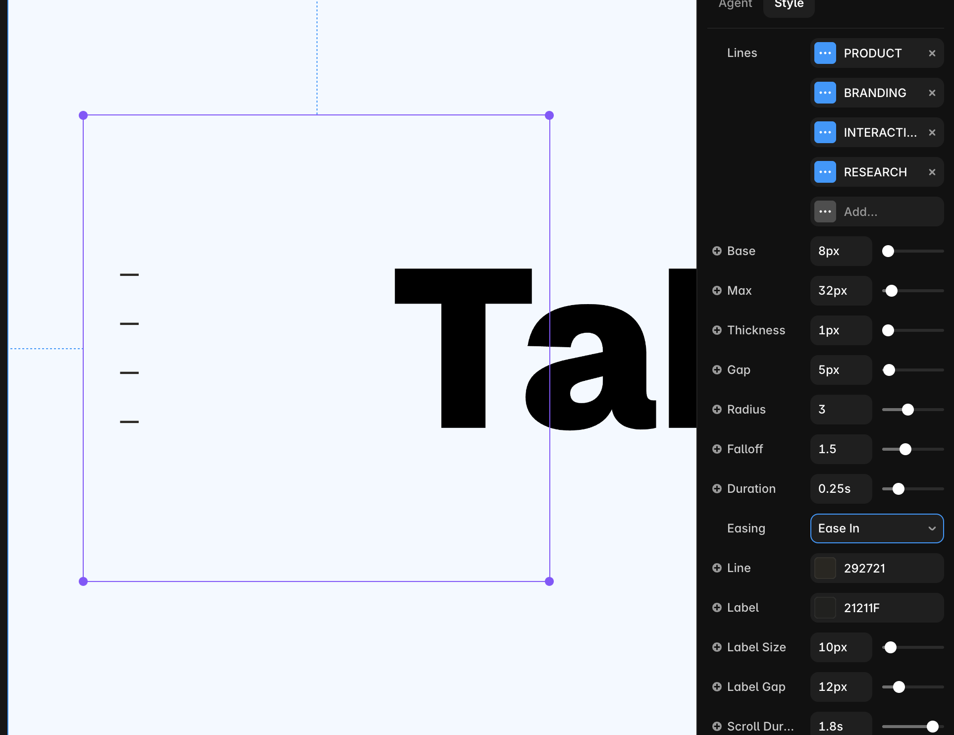
Table of Contents Navigation A GSAP-based navigation component . Each line can be linked to a section within a page or a different page for navigation. On hover, the lines smoothly scale and the neighboring lines scale to a smaller degree. Text reveals on hover, and on click it navigates to the linked sections. Features Per-letter hover scaling with adjustable max scale and neighbor falloff Auto-fit sizing — text scales to match your frame's width or width + height, just like a native Framer text layer Customizable scale Optional hover color, separate from the base text color Full Typography control (Font type, size, weight) Adjustable line gap, row gap Configurable transition duration and easing curve Multi-line support — each line breaks into its own row automatically Multi link and text support — each line can be linked with a dedicated text reveal Best for Secondary Navigation Portfolio and case study Table of content display Playful hover animation Any spot that needs a little personality on hover Need help? Questions or feedback, reach me on X https://x.com/vaishchityala
Introduction
Best way to hover and navigate
Rank history
Daily rank per list, from the first snapshot — lower is better.
- All · #2380