component
TabsCard
By Framer-Expert
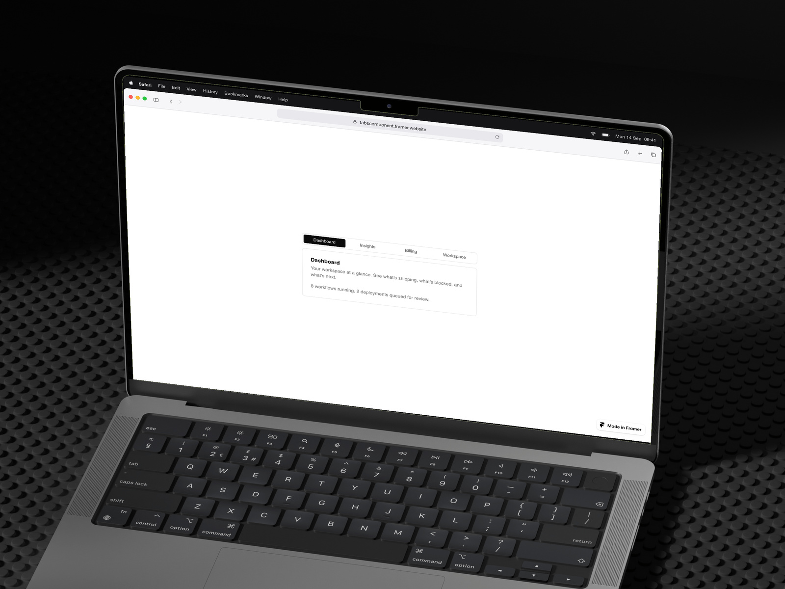
Details
- Framer-ExpertAuthor
- componentType
- 2026-04-27Published
- 2026-09-14Updated
- 2026-04-25Added
- NavigationCategories
Summary
Tabs Card — Customizable Tabbed Content
Description
Tabs Card — Customizable Tabbed Content Component A clean, flexible tabs component for showcasing structured content in any section of your site. Switch between unlimited tab panels with smooth transitions, perfect for feature breakdowns, FAQs, product details, pricing comparisons, or any content that benefits from organized navigation. Features Unlimited tabs — add or remove panels directly from the property panel Per-tab content controls: label, title, description, and body copy Equal-width tab distribution that scales to your container Full color customization: accent, background, border, title, text, and muted tones Adjustable border radius and width Custom font family support Lightweight, performant, and responsive Use cases Feature sections on landing pages Product specification panels Pricing tier comparisons Documentation and help sections Dashboard previews and SaaS hero modules How to use Drop the component onto your canvas, open the property panel, and edit each tab's content directly — no code needed. Adjust colors and styling to match your brand in seconds. Built for performance. Designed for flexibility.
Introduction
Customizable tabbed content
Rank history
Daily rank per list, from the first snapshot — lower is better.
- All · #6060