component
Trigger Arc Carousel
By Ryan Pourtemour
Details
- Ryan PourtemourAuthor
- componentType
- $14.00Price
- 2026-09-08Published
- 2026-09-09Updated
- 2026-09-08Added
- CarouselsCategories
Summary
3D arc cards · drag, snap, hover
Description
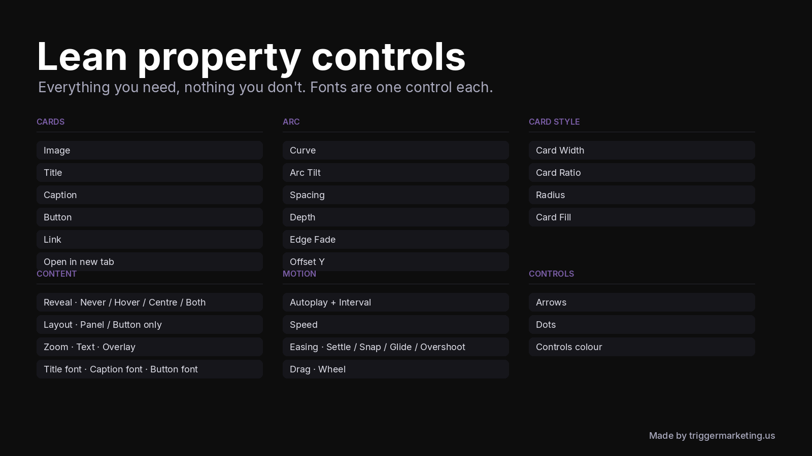
Looking for a Framer carousel component? Trigger Arc Carousel is a 3D card carousel and image slider for Framer — not a flat left-right scroller. Cards sit on a concave arc that tilts, fades at the edges, and snaps with momentum when you drag. How to install this carousel in your Framer project 1. Buy or Copy Component from the Marketplace 2. Paste into your Framer project (Cmd/Ctrl+V) 3. Drop Trigger Arc Carousel on the canvas 4. Add cards in the properties panel (image, title, caption, pill button, link) and pick fonts Works as a portfolio carousel, product showcase, gallery slider, agency case-study strip, or landing-page feature carousel. Built at 1040×640 and scales to any frame so Phone / Tablet / Desktop keep the arc. Features • Real 3D arc carousel — Curve, Arc Tilt, Spacing, Depth, Edge Fade • Physics drag & swipe — inertia + snap, four easings, optional wheel, tap to center • Hover / centre reveal — title, caption, CTA; or button-only layout • Typography — Title, Caption, Button each get one Font control • Autoplay carousel — pauses on hover / off-screen; off on the Framer canvas • Accessible Framer slider — keyboard arrows, Home/End, 44px targets, prefers-reduced-motion Who it's for Portfolios, agencies, product launches, image galleries — anywhere a flat Framer card grid isn't enough. Light or dark; every colour is exposed. Technical Single code component, no external deps. React 18 / current Framer. Chrome, Safari, Firefox, Edge. Unlink disabled to keep the engine intact. What's included TriggerArcCarousel · 8 demo cards · Controls for Cards, Arc, Content, Motion, and UI chrome Made by triggermarketing.us
Introduction
3D arc carousel · drag, snap
Rank history
Daily rank per list, from the first snapshot — lower is better.
- All · #6987