component
Two-Stage Expand Nav
By Val Casanova
Details
- Val CasanovaAuthor
- componentType
- 2026-06-22Published
- 2026-06-29Updated
- 2026-06-22Added
- NavigationCategories
Summary
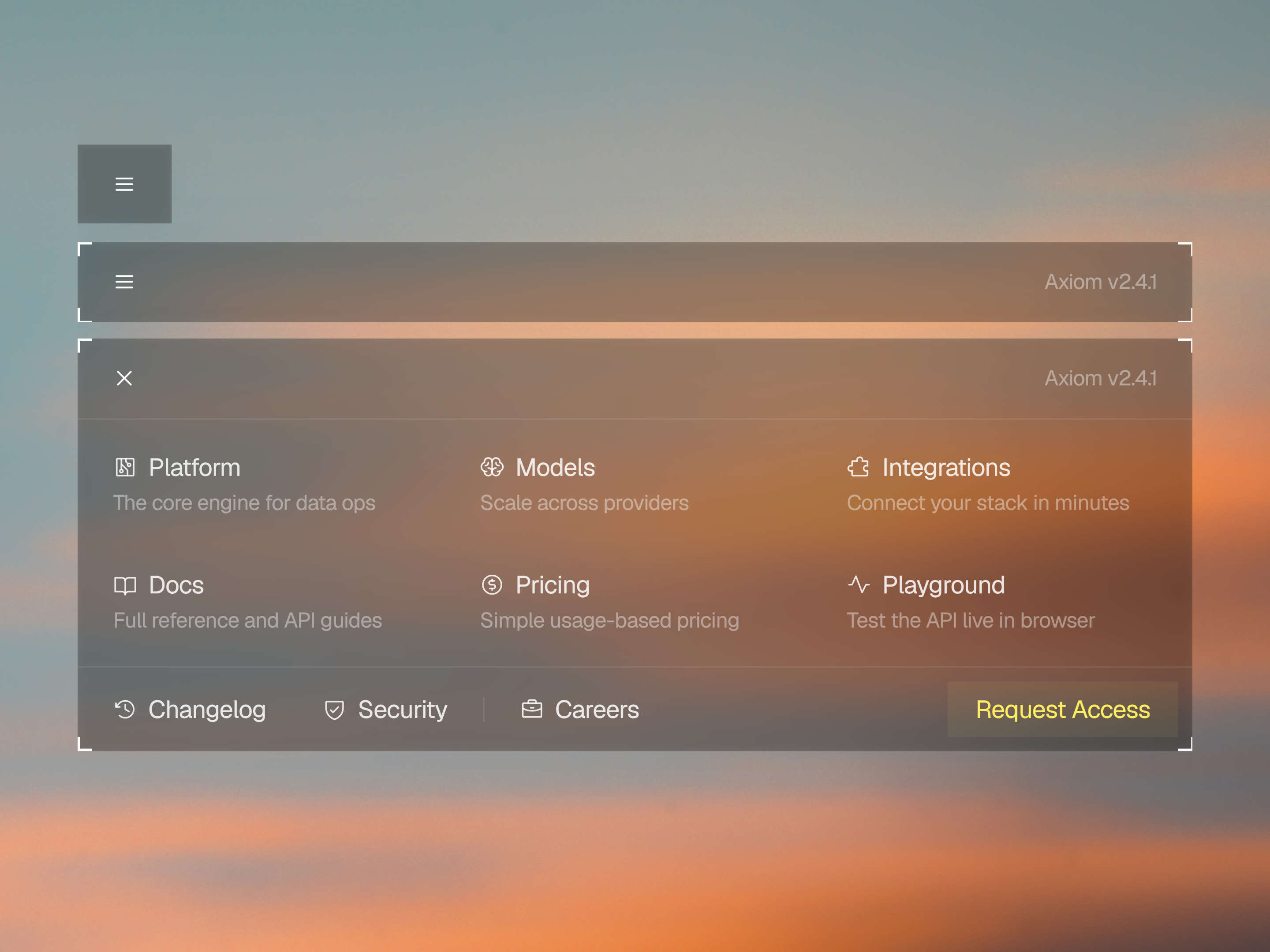
Expanding Navigation Component
Description
A terminal-inspired navigation component with corner-bracket styling and a smooth two-stage expand. The component starts as a compact icon button and expands in two precise stages into a full navigation panel. First horizontally, then vertically, revealing all links at once. The animation is clean and modern, perfect to match the style of modern AI and data products. The expanded panel uses a grid layout with Phosphor icons, titles, and short descriptions per link, plus a secondary row for less prominent links and a CTA button. What's included Two-stage expand/collapse animation (Smart Animate) Main links with icon, title, and description Secondary link row for additional pages Dedicated CTA button Corner-bracket frame styling Customization The component is fully adjustable. All labels, descriptions, icons, and the CTA are completely editable. Use as is or as a starting point for more complex navigation systems.
Introduction
Expanding Navigation Component
Rank history
Daily rank per list, from the first snapshot — lower is better.
- All · #1842