component
Calendar Demo
By Framer-Expert
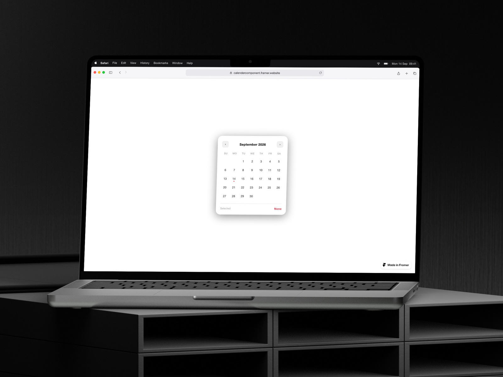
Details
- Framer-ExpertAuthor
- componentType
- 2026-03-11Published
- 2026-09-14Updated
- 2026-03-04Added
- FormsCategories
Summary
Customisable Calendar Component
Description
A beautiful, fully customisable calendar component built for Framer. Stop wrestling with shadcn, Radix, or clunky date pickers that don't fit your design. This component is self-contained, zero-dependency, and wired up with Framer's native property controls — so you can tweak every visual detail without touching a single line of code. What you can control from the Framer panel: Background color Text color (day numbers, headers, and labels all update together) Accent color — selected date, today indicator, footer label Border — toggle on/off, choose color, width, and corner radius Shadow — toggle on/off, with full control over color, X, Y, blur, and spread Default selected date Built for real projects: No external dependencies — works out of the box in any Framer project Fully typed TypeScript with clean, readable code Smooth hover and selection transitions Today indicator with accent dot Month navigation with year rollover Selected date shown in the footer Works great for booking flows, event pickers, dashboards, portfolio sites, and any project where you need a date picker that actually looks like it belongs.
Introduction
Customisable Calendar Component
Rank history
Daily rank per list, from the first snapshot — lower is better.
- All · #6045