component
RadioGroupCards
By Framer-Expert
Details
- Framer-ExpertAuthor
- componentType
- 2026-02-11Published
- 2026-09-14Updated
- 2026-01-21Added
- FormsCategories
Summary
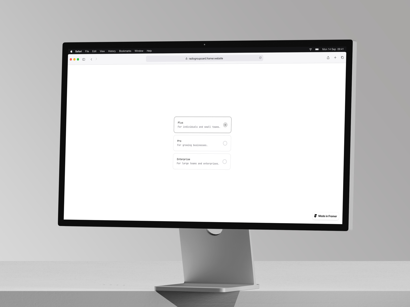
Animated radio card selector
Description
Overview A polished radio group component that transforms standard radio buttons into elegant, interactive cards. Built with Framer Motion for smooth animations and designed to match modern UI standards. Features Animated interactions — Smooth tap animations and radio dot transitions powered by Framer Motion Fully customizable — Control colors, spacing, typography, and border radius directly from the properties panel Flexible layout — Switch between vertical and horizontal orientations Dynamic options — Add, remove, and edit options directly in Framer without touching code Accessible — Built with proper ARIA roles and hidden native radio inputs for screen reader support Light & dark mode ready — Easily configure for any color scheme Customization Options Background, border, and accent colors Title and description text colors Radio button styling Padding, gap, and border radius Font family and sizes Vertical or horizontal layout Perfect For Pricing plan selectors Subscription tier selection Settings and preferences Survey and form inputs Onboarding flows Any single-choice selection UI How to Use Drag the component onto your canvas Edit the options array to add your choices (ID, title, description) Set the default selected value Customize colors to match your design system Choose vertical or horizontal layout
Introduction
Animated radio card selector
Rank history
Daily rank per list, from the first snapshot — lower is better.
- All · #6089